There are several affiliate links throughout this blog post. When you shop through these links, I receive a small commission at no extra cost to you. Forever thankful for your support. The bag in this post was gifted to me by the brand haerfest.
I’m trying to incorporate more photography and graphic design posts on the blog in 2019. I’ve gotten so many questions on how I maintain cohesive branding across different platforms. It’s a pretty simple process at this point, but it definitely took a little bit of time to figure out what works and what I liked most. This post will be walking you through 5 tips and tools to create your own bomb graphics. The first few things will be helpful regardless of whether or not you are working in the Adobe Creative Cloud. But, I will be sharing some tips for making the graphics creation process super easy so that you won’t have to spend much time on this portion of publishing blog posts.
Let’s get into it and it’s time for everyone to pretend that #graphicdesignistheirpassion.
 1. Pick complementary fonts and colors that are easy to read.
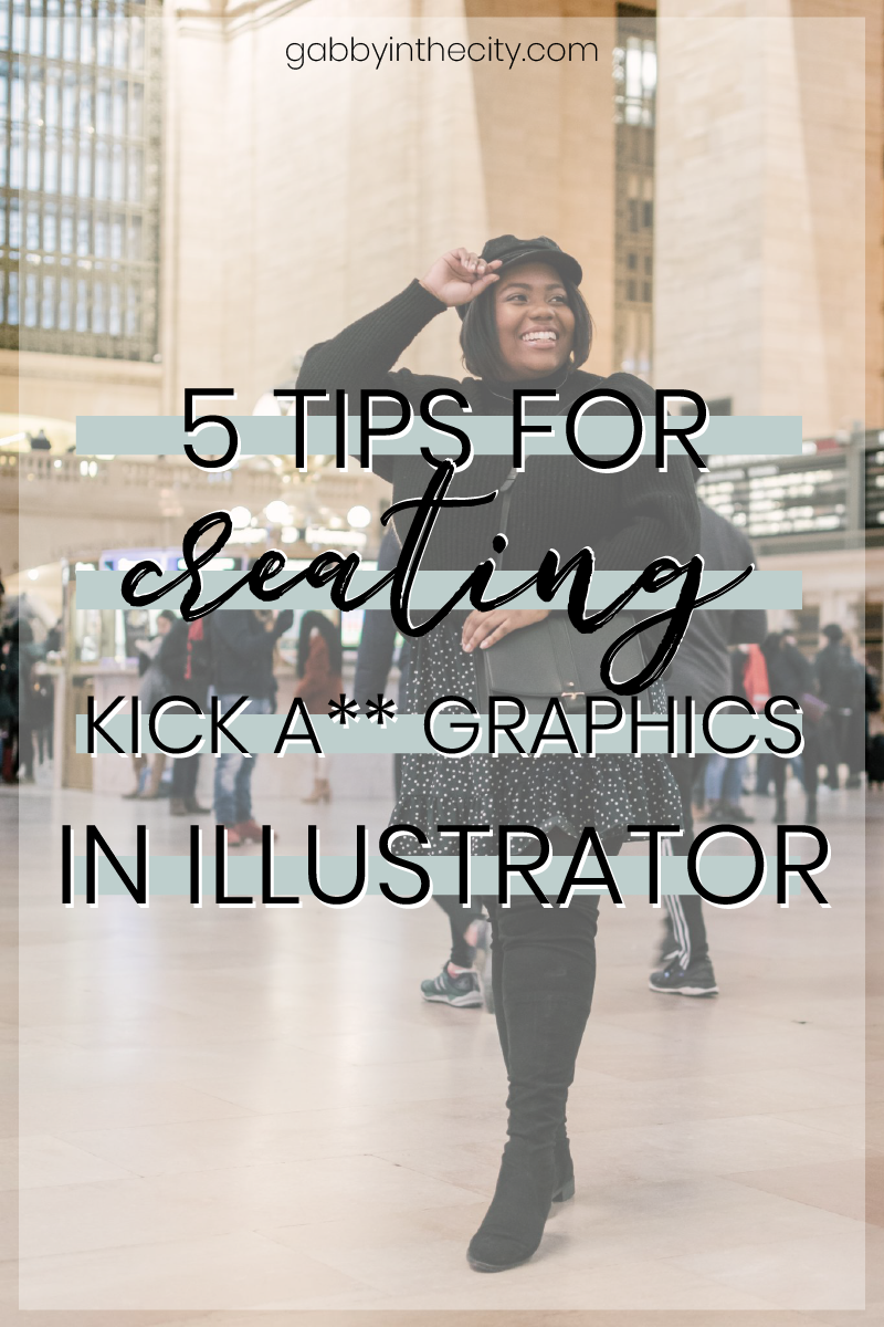
Pinterest can drive a ton of traffic to your site. BUT, you have to be able to captivate someone to click on your posts. One way to do this is by maximizing your font and color choices. I did a lot of research on colors, fonts, and titles while I was in my graphic design class and I didn’t know at the time how much that would improve my graphics game for the blog. When I was rebranding, I made sure to work some of that new #knowledge into my new blogging game plan.
Smart Fonts
My number one tip is to choose fonts that are easy to read with a quick glance in a zoomed out view. I spent hours combing through Google Fonts and DaFont.com to pick the perfect fonts for my graphics and website. I would seriously recommend using a sans serif font as they are easier to read and less distracting. You can choose a decorative font for an accent to give your graphics some interest and make them more unique. If you end up downloading any of the fonts from DaFont.com, make sure to check out the licensing information and be sure to purchase the required license for your usage level. We respect creators in this household.
Cool Colors
My second tip, nearly as important as the first, is to choose colors that are appealing to the eye. You’ll notice that my new brand color scheme incorporates a light green, black, and white. It is simple and fits my aesthetic while it’s also ], unknowingly, extremely pleasing to the human eye. The color green is friendly and inviting which is just what I need when I want to get people to click on my graphics.
2. Make note of optimal dimensions for each social platform.
Each social media platform has optimal dimensions for graphics and images that are shared on the platform. I can’t stress how important it is to resize and design your graphics for each individual platform. The nice thing about software services like Canva and PicMonkey is that they allow you to pick from templates that are already pre-designed with different social platforms in mind. I’ve listed below the dimensions that I use when creating graphics for each platform.
Pinterest – 600 px x 1200 px
Facebook – 1200 px x 630 px
Instagram Stories – 1080 px x 1920 px
Youtube – 1280px x 720 px
Twitter – 506 px x 253 px
3. Maximize efficiency by creating Adobe Illustrator templates that utilize layers.
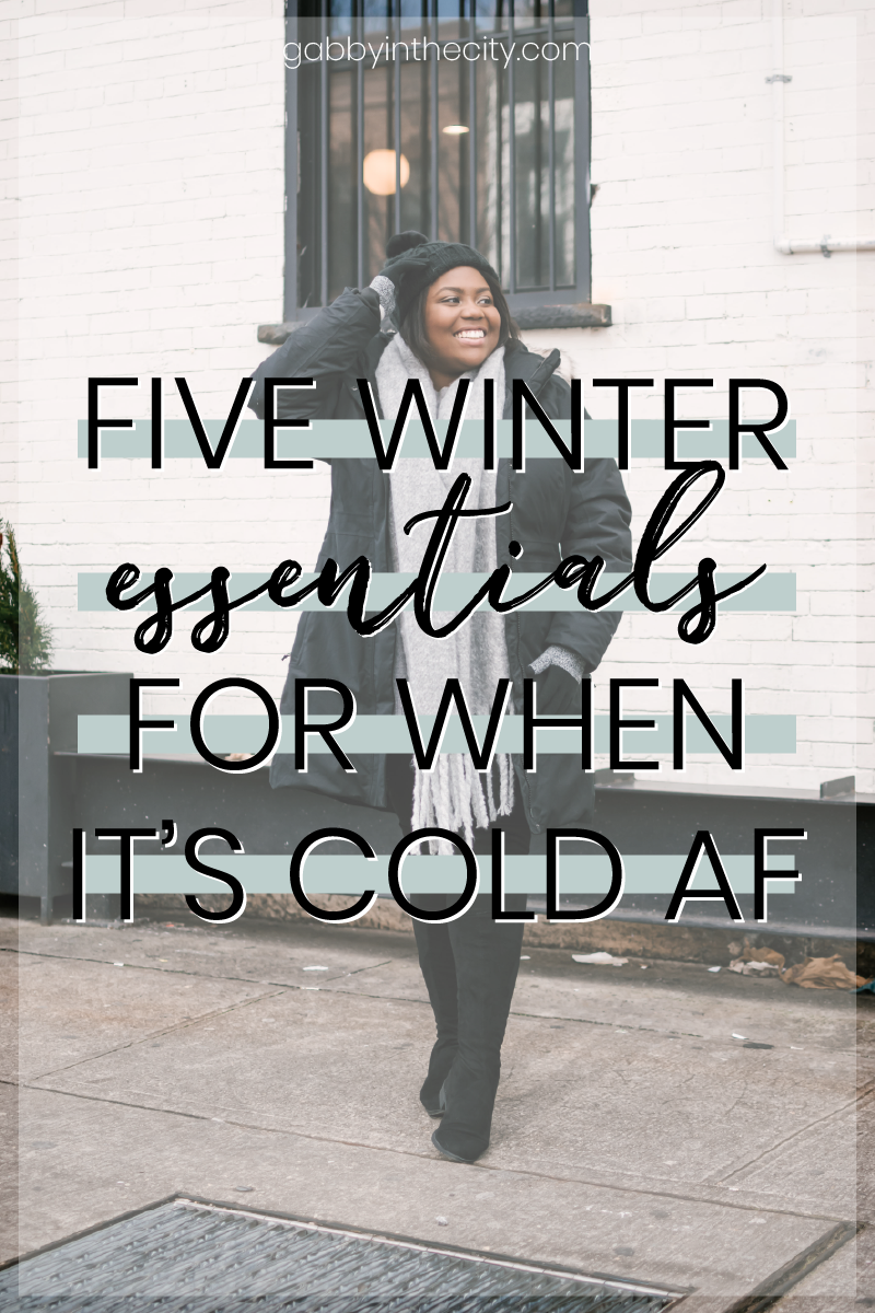
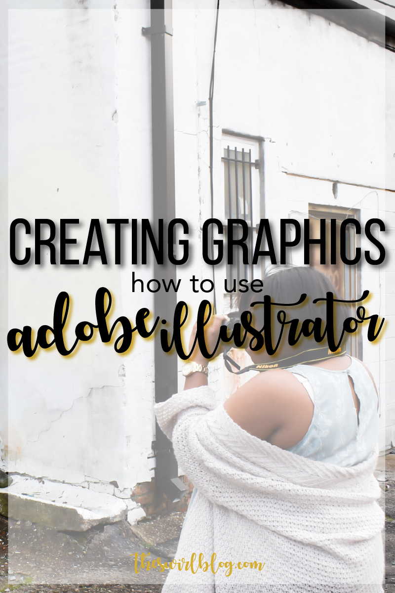
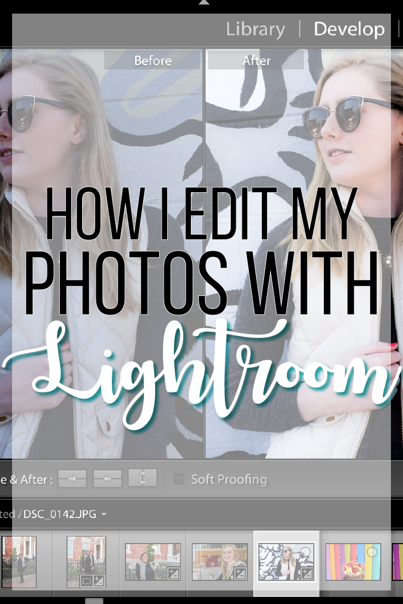
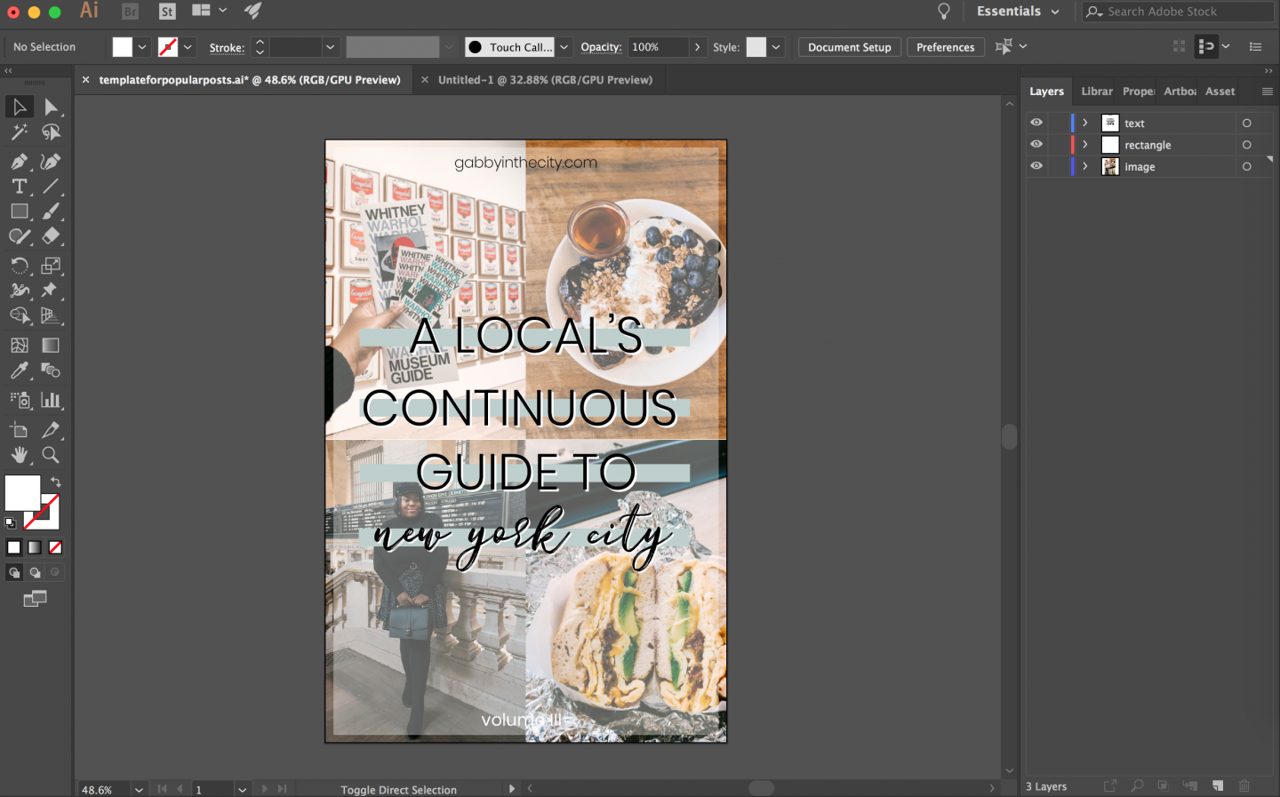
You’ve probably noticed that a lot of my graphics are the same basic structure with different images as the backgrounds. I think having a consistent graphics design helps build a brand for your blog. My featured images take me as little as 5 minutes to create now. I do this by utilizing layers. This makes designing a template for my featured images and graphics extremely easy.
I usually create a layer for text, my image and clipping mask, and a transparent rectangle to make my text easier to read. You can lock and unlock layers in Adobe Illustrator which makes editing the background easy even when there is text present on top of it.
4. Choose a shape or icon that can be used as an accent in small graphics.
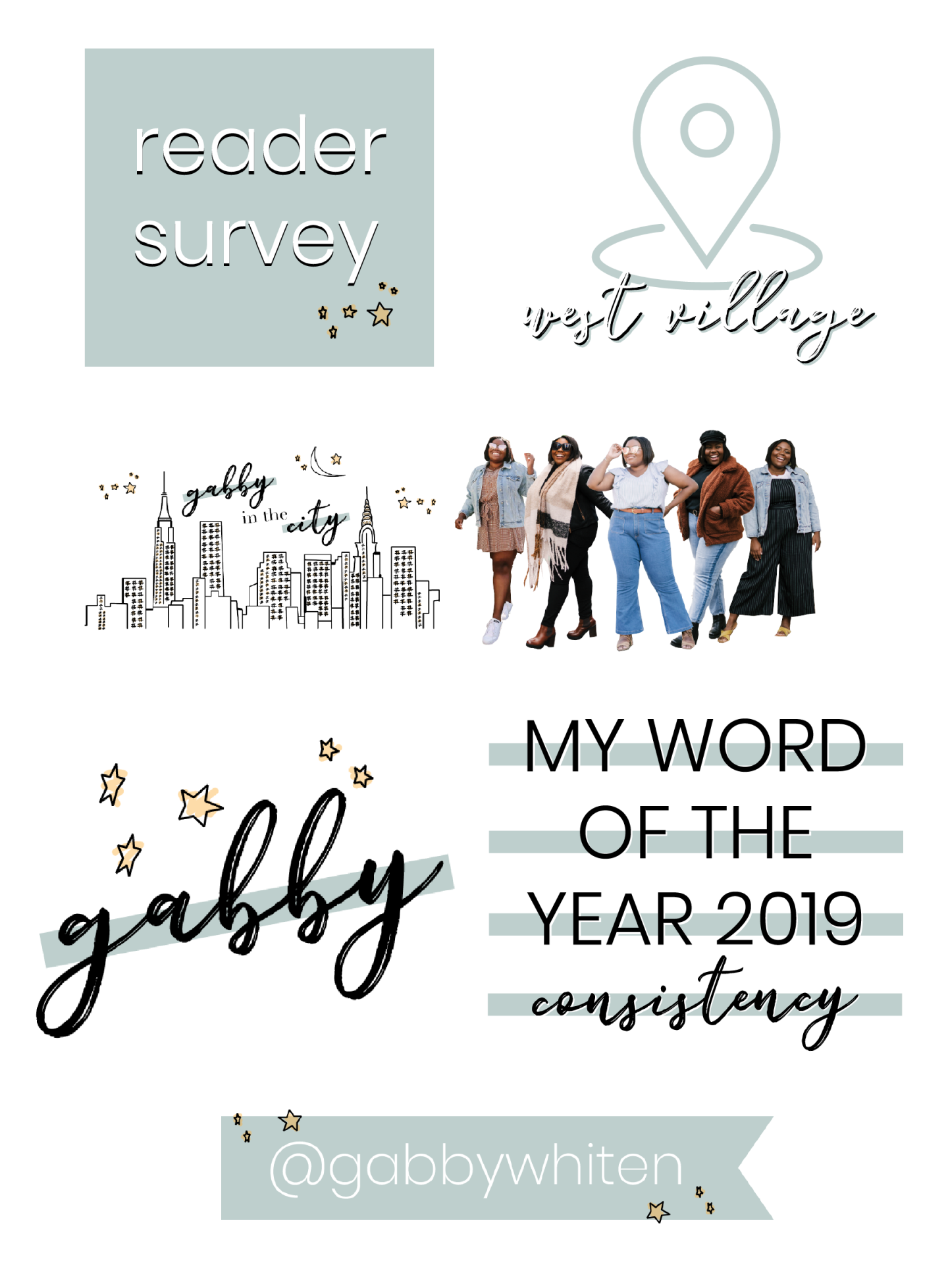
I think it’s so easy to use different shapes and icons to tie all your graphics together. You’ll see that I play a lot with the stars from my logo on to all different types of graphic elements. My Youtube video location tags, newsletter headers, and Instagram story templates all have this element implemented into it.
The goal here is to find a pattern or shape that fits with your brand. You can’t even see stars in the NYC sky, but I felt like adding stars and a crescent moon was an easy way to jazz up my logo. I also knew that stars were becoming a trendy staple when it comes to clothing and accessories. I also like to play with color blocking rectangles, circles, and letter elements. My favicon incorporates my font, stars, and rectangles.
5. Use the pen tool to trace images to create your own vector art.
I get so many questions about my logo. Who designed it? How did you make that? Well, I did the whole thing in Adobe Illustrator and I used a random NYC skyline image from Google to serve as the basic schematic. You can use the pen tool to create different layers that would come together to form buildings. I also used the pen tool to create the stars and moon as well. Here is an Adobe tutorial for how to use the pen tool.
My graphic design professor told us to practice on a picture of ourselves. I think this is an incredibly easy cheat way around not being able to sketch or draw. I’d highly recommend just playing with a couple of random pictures [ in my graphic design class, we did traces of our own selfies ] to get more comfortable with the tool because it is amazing!
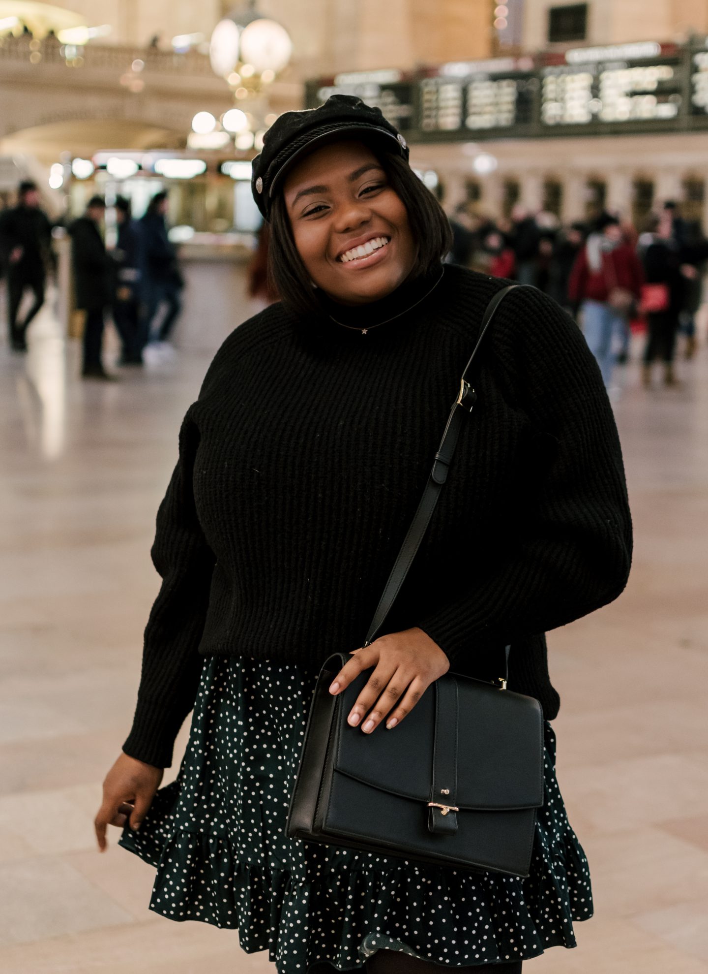
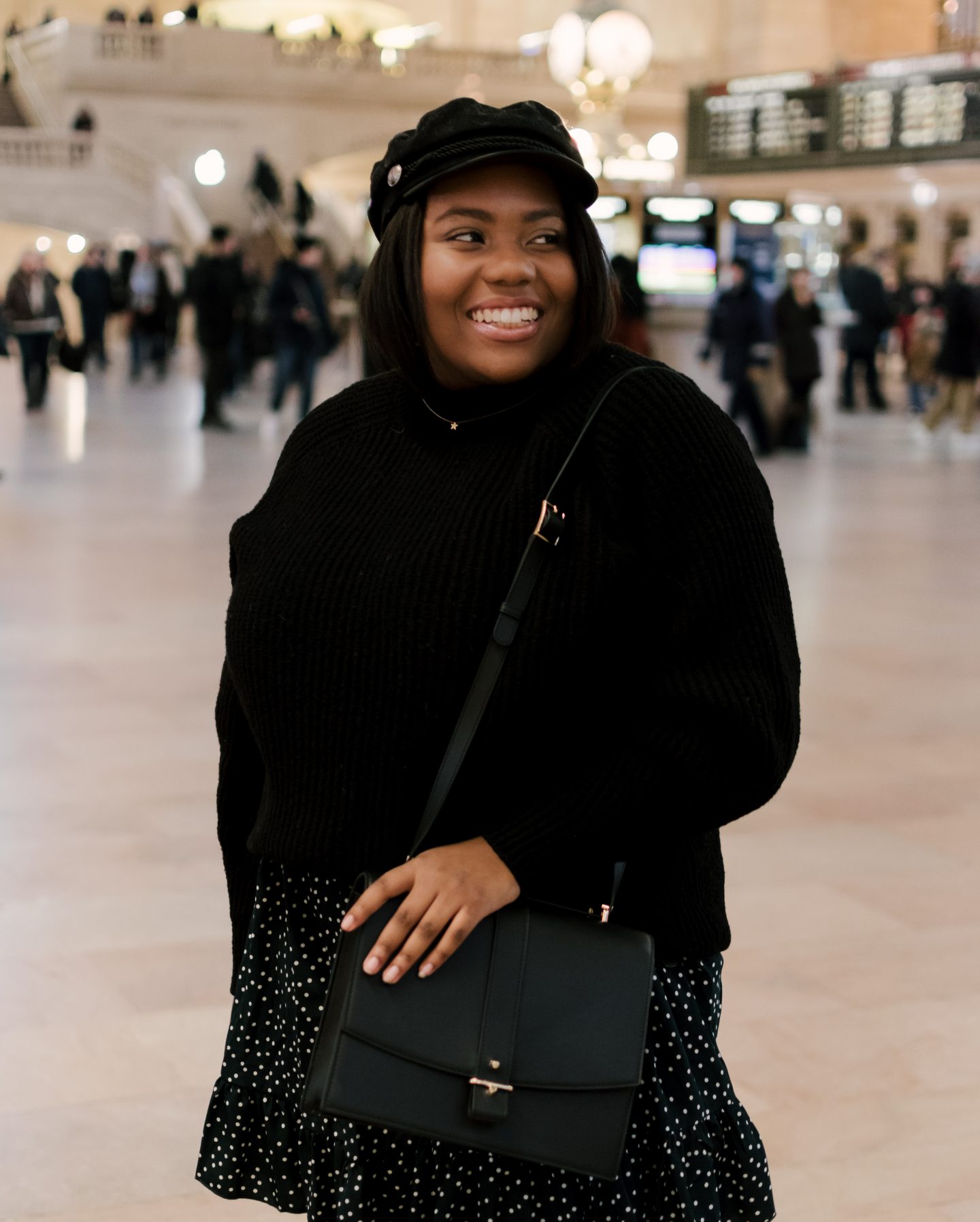
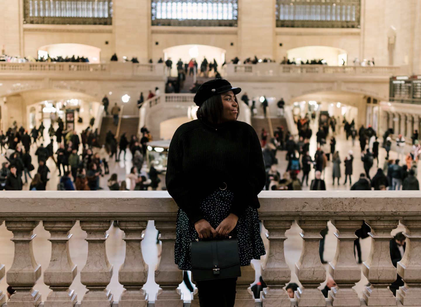
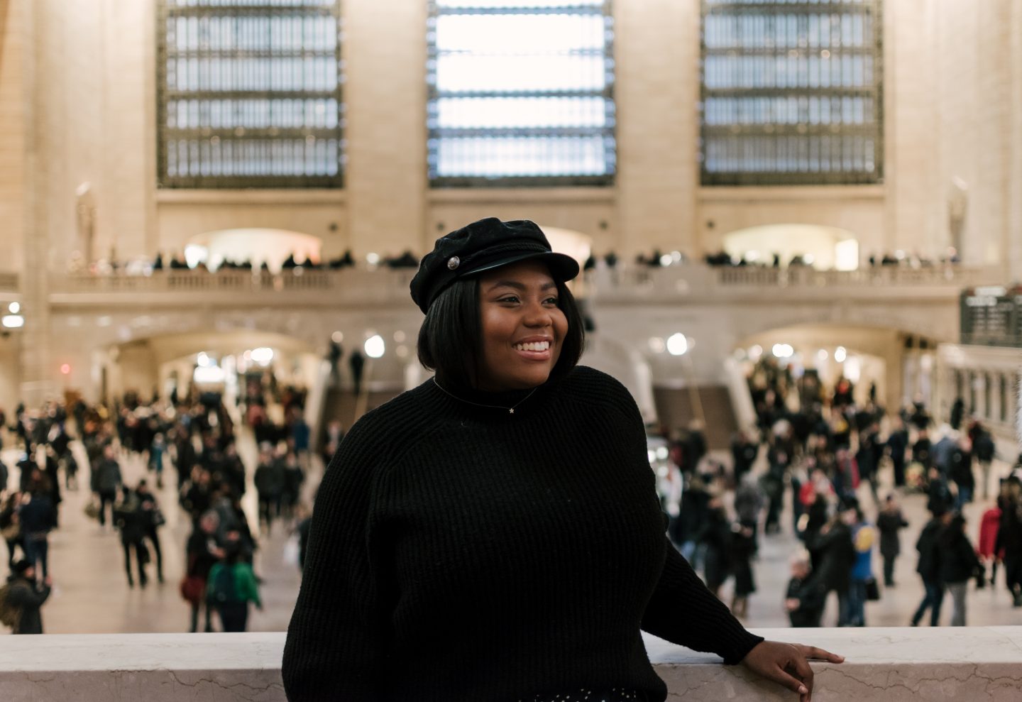
Hat | Sweater | Dress (plus)| Boots
It’s no secret that I love Adobe Illustrator and the graphic design class that I took my senior year of college was probably one of my favorite non-STEM classes. It allowed me to be a little more creative than in any of my other classes. I highly recommend that you invest time/money in a class that walks you through all the Adobe programs. I’d maximize learning Adobe Illustrator and Photoshop.
Keep on keepin’ on,
