Hey y’all! This week I’m going to be talking about the two most dreaded words in all of blogging: media kit. In case you’re unfamiliar with a media kit, it’s kind of like a resume for your blog. You get to showcase what your blog is all about, your reader statistics, and pricing information for brands.
It can be pretty intimidating to create a media kit from scratch, so today I’m going to share my design and content tips for creating a killer media kit!
Throughout this post, I’ll be sharing some screenshots from an old media kit that we created! We designed ours on Adobe Illustrator, but Canva is also a great (free!) online design resource.
Media Kit: Before you begin
Create a theme
Unlike a boring old work resume, your media kit is a chance to show off your blog’s personality! Ideally, the color scheme you choose would match your blog’s existing logo and color scheme. For us, our main colors are white, gold, teal, and peach!
I would also choose two or three different fonts – a fun script-y font for headings and an easy-to-read block font for paragraphs.
Gather statistics
Ideally, you want to update your media kit every 1-2 months to keep the statistics fresh. Take a few minutes to gather page views and social media counts for all of your platforms.
If you have a pretty low follower count for one social media platform (ours is YouTube), it’s OK not to include it!
If you can, also gather reader demographics. On Google Analytics, you can track some simple demographics (age, gender) by going to “Audience” > “Demographics” > “Overview.”
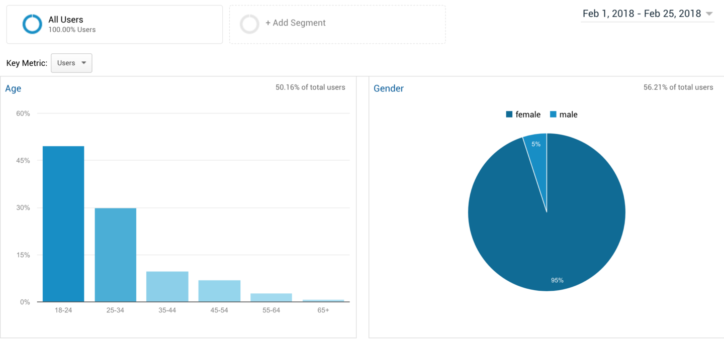
Finally, write down the top 3-5 blog posts that you want to highlight in your media kit! These can be your most-read posts, but they can also be posts that you feel really showcase what your blog is about or posts that you really loved to write.
Media Kit: The Layout
The beauty of a media kit is that you don’t have to stick to a one-page limit like a typical resume. A typical media kit can be anywhere between 2 and 4 pages, depending on graphics and information you want to include. Here’s the layout of our media kit!
Page 1: Intro
This page showcases who we are, why we started the blog, a little bit of our photography, and some of our social media statistics.

It’s a nice intro to the blog, and brands can easily see if our blog would be the right fit for their target demographic. Plus, the photography is a great way to grab their attention!


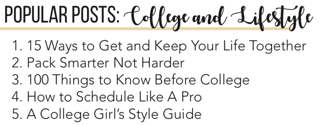
Page 2: Popular Posts & Page Views
This page highlights some of our most popular posts, our reader demographics, and our page views!

Page 3: Pricing & Working With Us
This page is all about our pricing and the nitty-gritty of working with us. I know that pricing your services can be a bit intimidating, but a good rule of thumb for a sponsored post is $100 for every 10,000 monthly page views. Same goes for a Facebook, Twitter, or Instagram promotion!
Notice I said “rule of thumb”! Don’t undersell yourself. If you believe you’re worth more, charge for it!
The “nitty-gritty” includes how to pay us, when to expect the work, and what each “package” includes in terms of writing and social media promotion. Not exactly the most exciting stuff, but a necessary evil so that you and brands are on the same page.
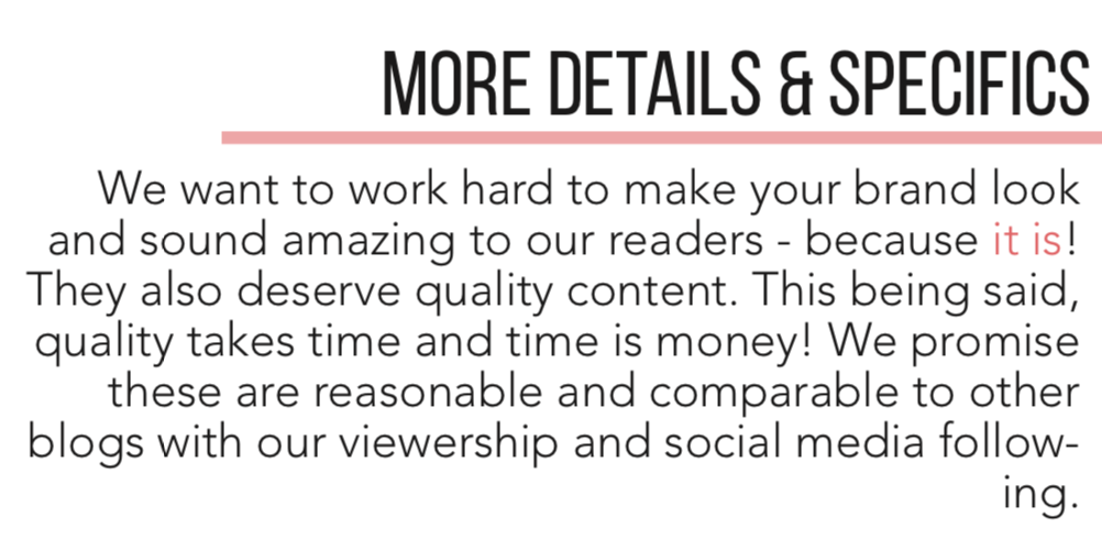
Also, make sure you include your policy on giveaways and product reviews. Should they just send you the product? The product plus a fee? Lay it all out in the media kit so there’s no confusion!
Final Tips & Tricks
- Don’t get frustrated if you can’t get the layout jussstt right. Sometimes it’s good to come back in a few days and re-visit it; you might find a new way to organize that you didn’t see before!
- Have a second (or third) pair of eyes look over it! They might see that little typo or have a cool suggestion for a layout. If you want us to look at it, send it on over to hello@theswirlblog.com!
- Save the file as a PDF so you can easily send it over email to any potential clients.
- Make sure it looks good on printed paper! Sometimes the margins and formatting can get messed up when you try to print. That’s not what you want if a brand decides to print your media kit for review!
- Like I said earlier, revise your media kit every 1-2 months to keep the statistics and page views up to date!
Those are all my tips for creating a killer media kit! If you have any questions at all, want us to look over your media kit, or want to see ours, email hello@theswirlblog.com! Are there any other “Blogger Basics” posts y’all want to see? Let me know in the comments down below! Have a fantastic week, y’all!
cheers,


