Last week, I posted all about one of the more stressful parts of blogging: editing your photos. Although stressful, is also one of my favorite things to do as well. This week, let’s talk about your graphics. Featured images are going to be one of the first interactions your audience engages with on social media or in their email inbox. They need to be consistent with your brand, eye-catching, and direct. I am not an expert, but I’m pretty happy with the evolution that is the design of our featured images.
Illustrator can be one of those tricky programs that Adobe has, but there is so much customization here. You just need to know where to tap into! This week and last week’s post was originally going to be all one post, but 3,000 words later and I knew that was not going to work out. So, I spit it up. Today, I’m going to show how I made one of my recent featured images. If you’re interested in learning how I work my magic, keep reading!
Why Illustrator?
Although Canva had my heart, I find that Illustrator opened up my world to a whole new level of capability. My graphics have improved in quality and I don’t feel limited by font choices or file formats. Seriously, if you can get either Photoshop or Illustrator, please do it!
I am still way to intimidated by Photoshop to even begin instructing others on how to use it, but I have a handle on my little Illustrator template and have looked up several how to’s to find out how to do all the simple, annoying things that you would think would be super simple to figure out. Haha nope. I’ll be showing you start to finish how I create my featured image using Illustrator, so here goes nothing!
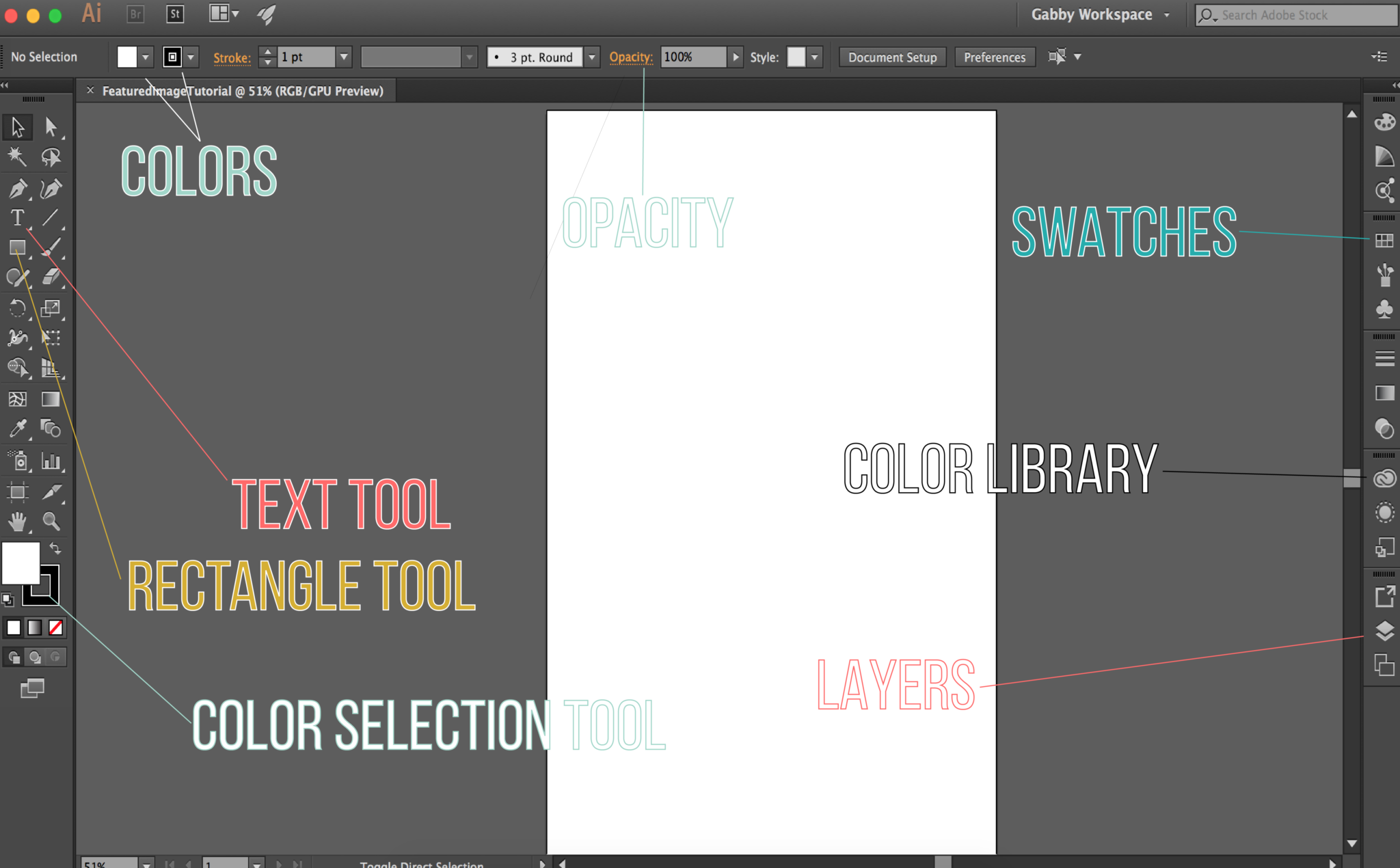
Important Buttons and Tools!
Set Up
The first thing that you obviously see is the set up screen. I always name my graphics “WhateverItIs_Template” because eventually I will just be using this file as a template for all future needs. This is how I avoid the very annoying steps that we’ll go through together here in this quick tutorial. Please leave comments below if this is confusing in any way!!
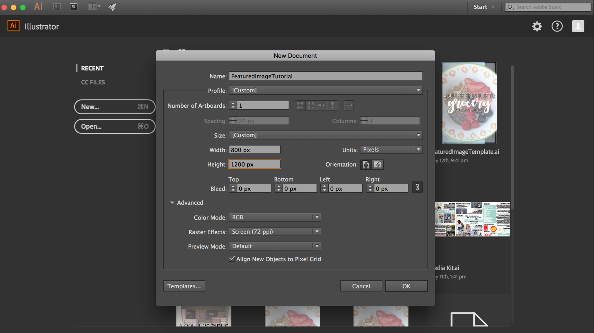
Sizes
Size matters—for graphics anyway. I’ve listed some of the dimensions for common graphics and what you should enter into the customizable slots for pixel lengths. {All sizes are width x height.}
Image 800 px x 1200 px
Youtube
Banner 2560 px x 1440 px [Fit all graphics in 1540 px x 427 px center box.]
Thumbnail 1280 px x 720 px
Header photo 1500 px x 500 px
Image 440 px x 220 px minimum
Photo 1080 px x 1080 px
Cover Photo 820 px x 312 px
Shared Image 1200 px x 630 px
You won’t need to edit any of the other options.
Adding Layers!
I’ll be showing you how to make the Pinterest image for one of my more recent posts! Yippee. The next thing you’ll need to do is make three layers, this is going to make editing, shifting, and moving any text or shapes that you add later so much easier!
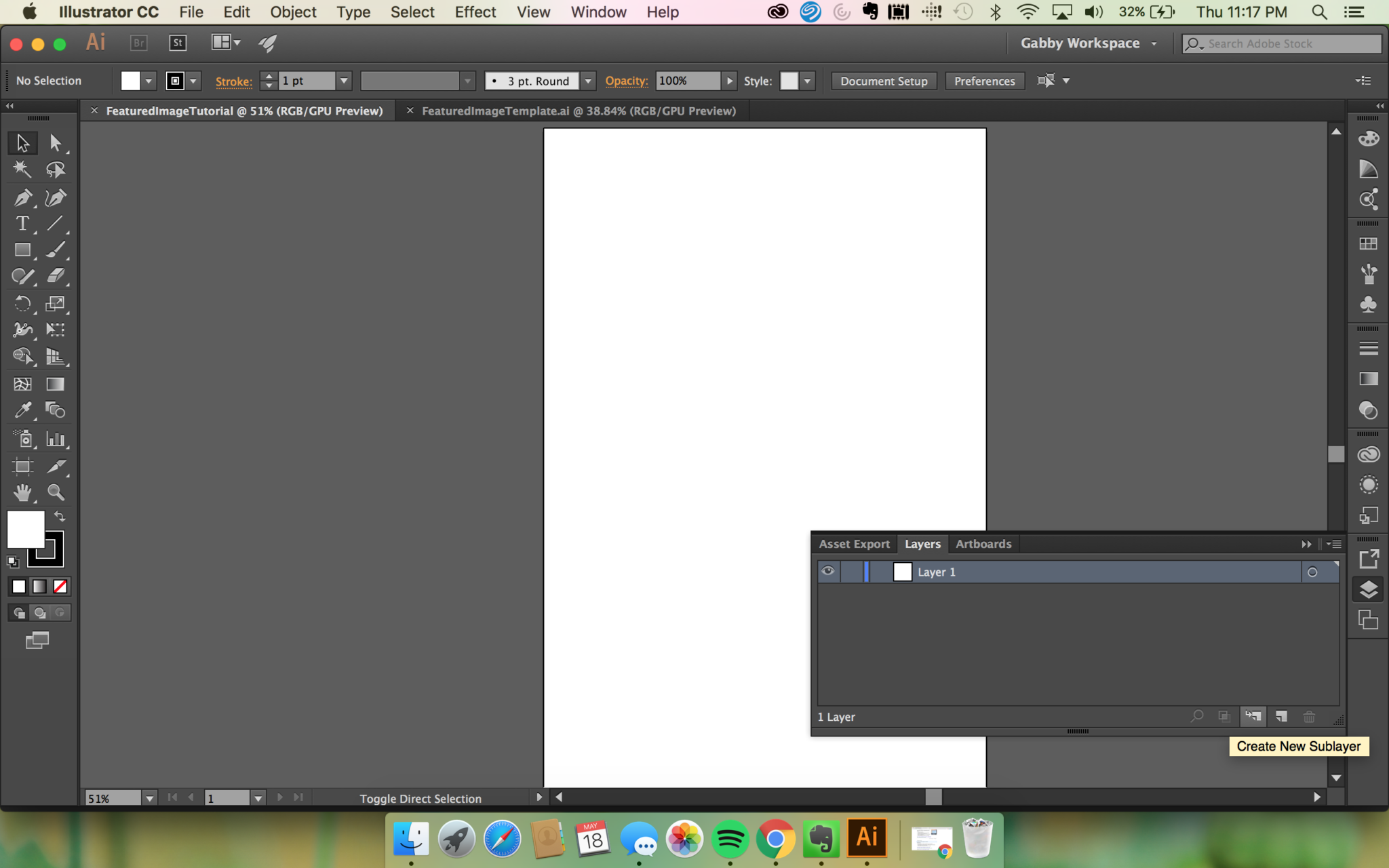

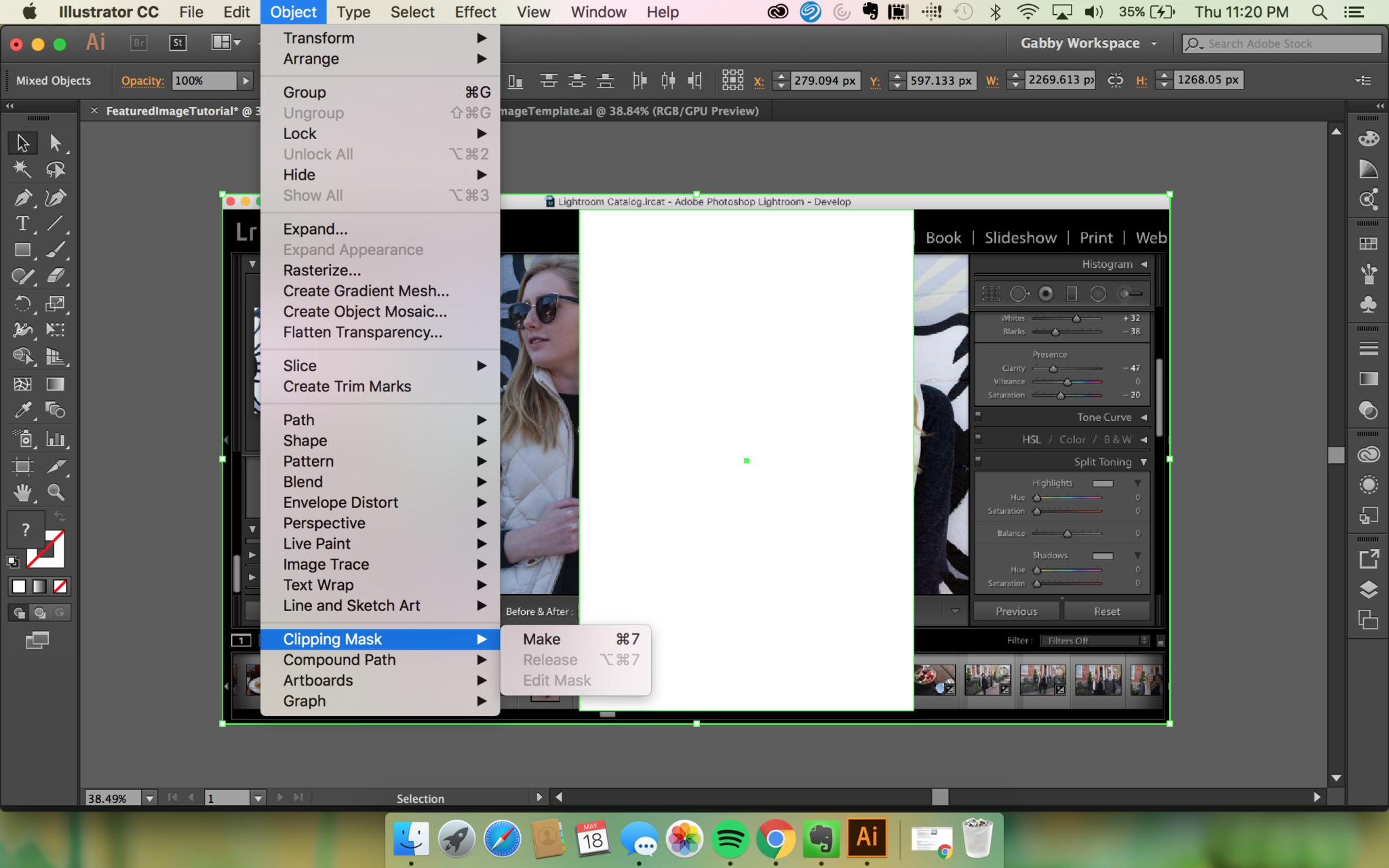
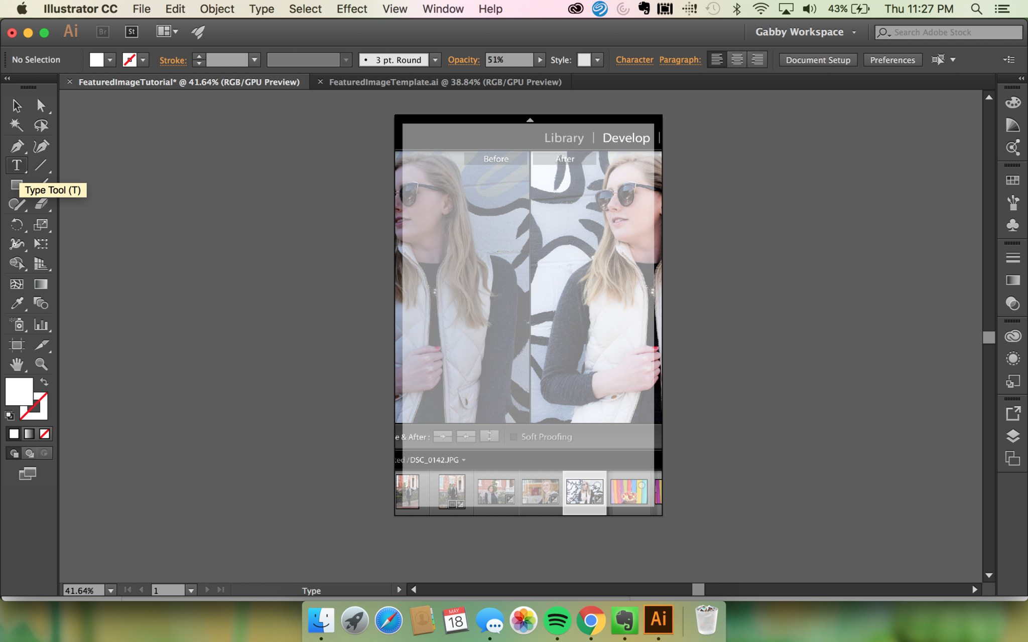
In Layer 3 [simply click on the layer to place objects within it], you’ll need to place the photo that you want to use for your background and completely cover the art board [press down shift before enlarging to keep the dimensions locked to avoid warping].
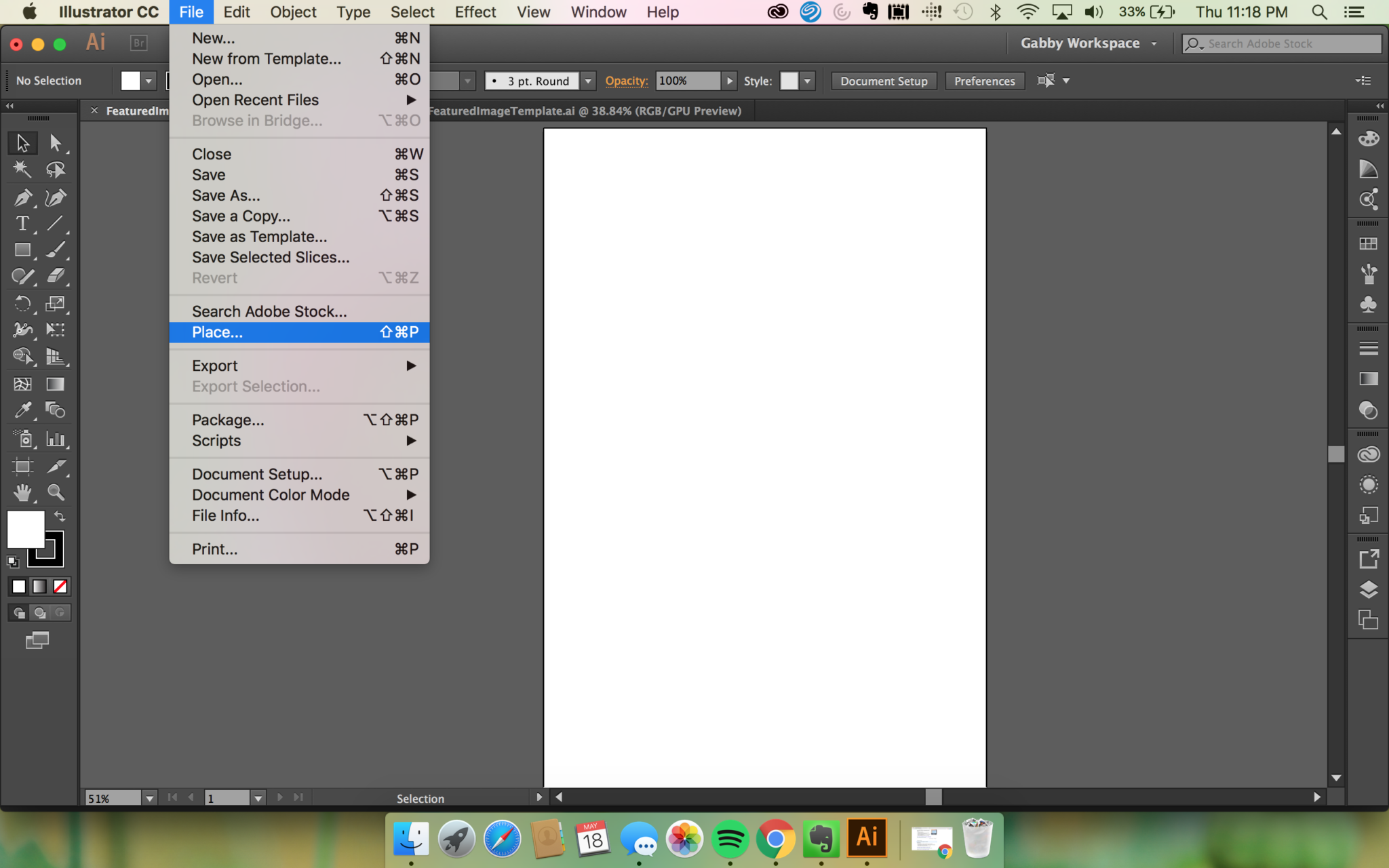
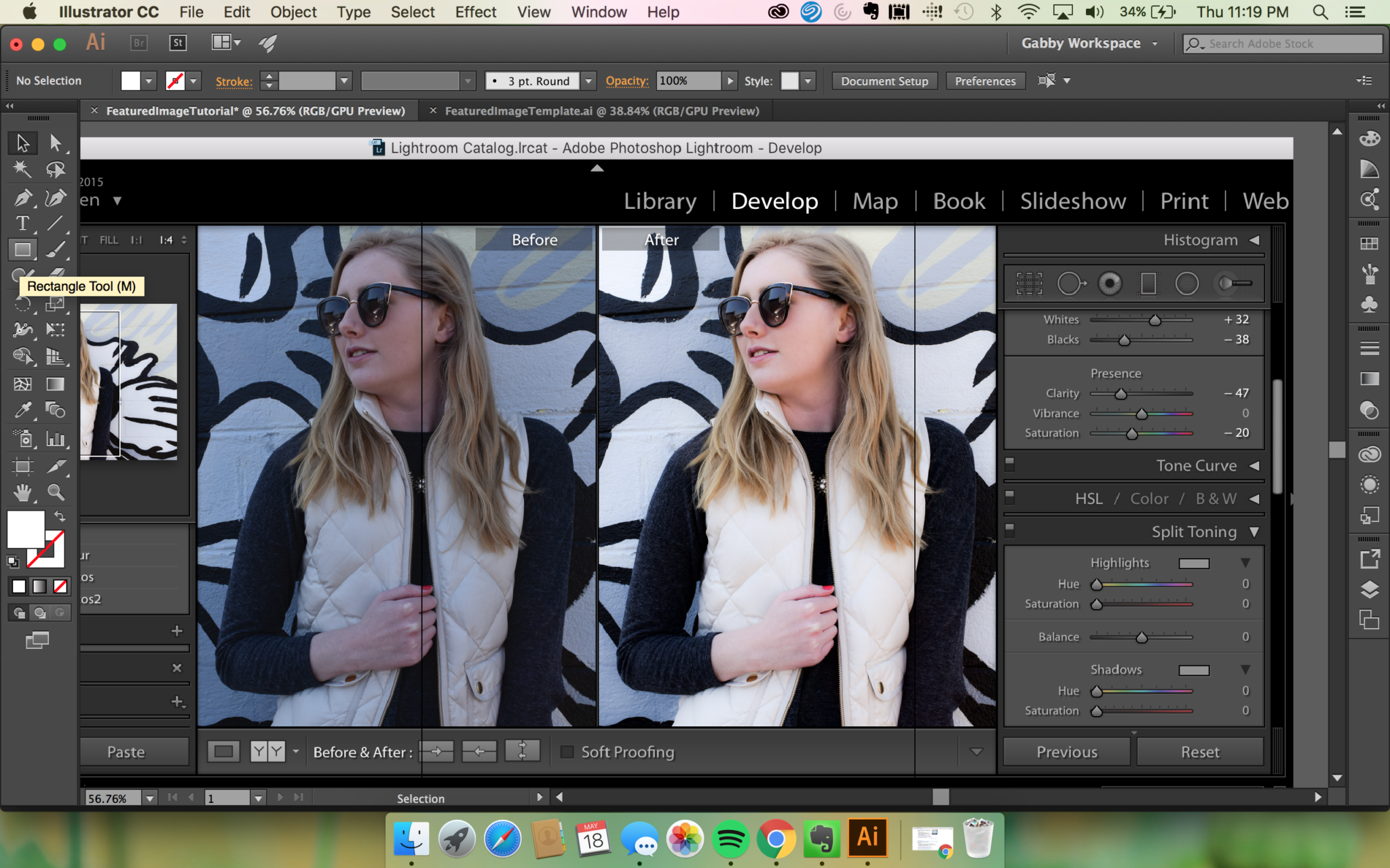
After that, you’ll use the rectangle function, and add one that is the same size as the art board. Then you’ll need to select both of these objects and go to File > Clipping Mask > Make. This will get rid of any bleed off the art board. You can reposition your photo by double clicking on the image and then dragging it around.
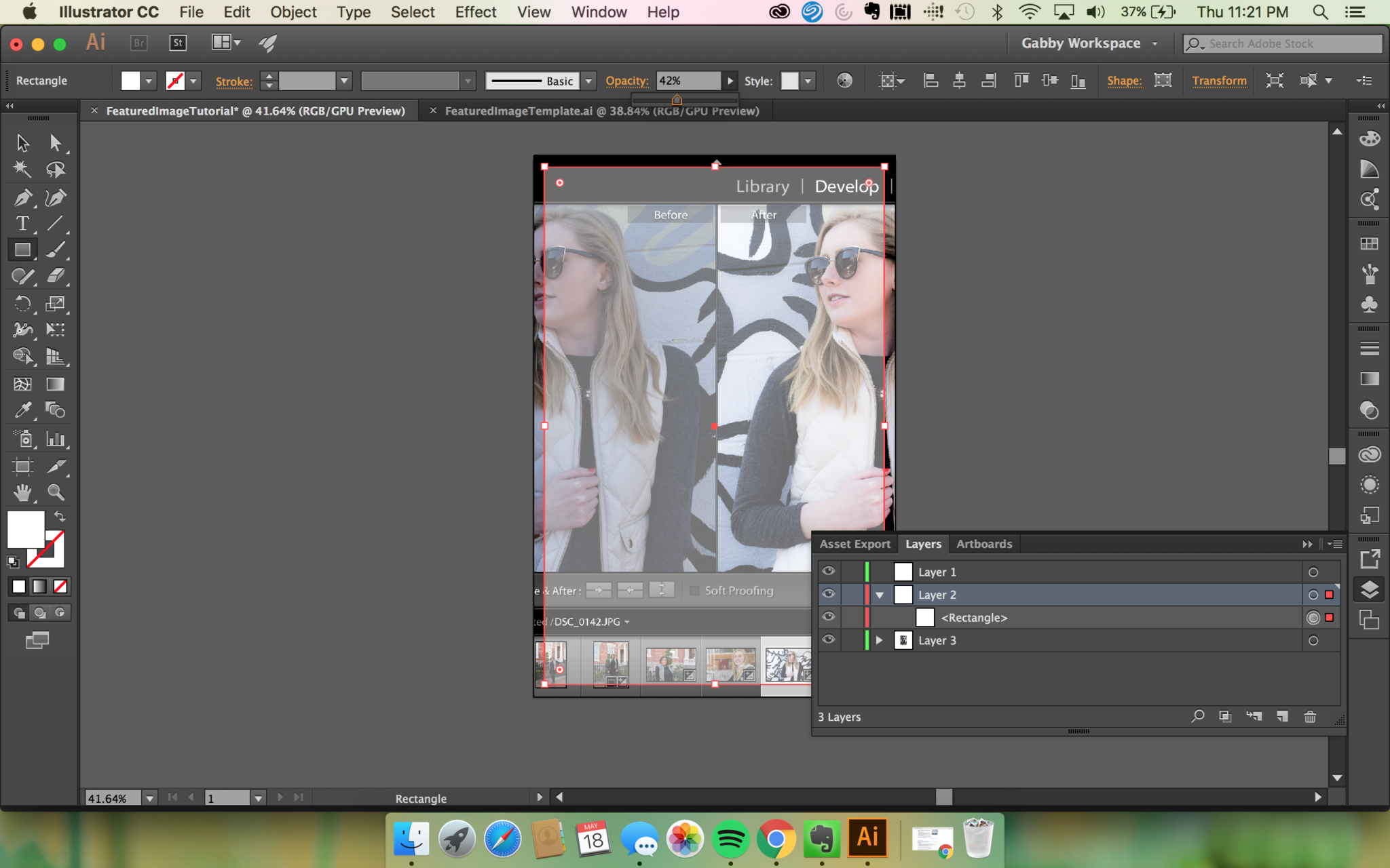
Next, you need to add a rectangle into level 2 that you’ll use for your slightly transparent cover so that it’s easier to read the fonts over some photos that have a lot of colors or details. I leave the opacity around 40-50%. You can change the color of the rectangle, but I leave mine on white.

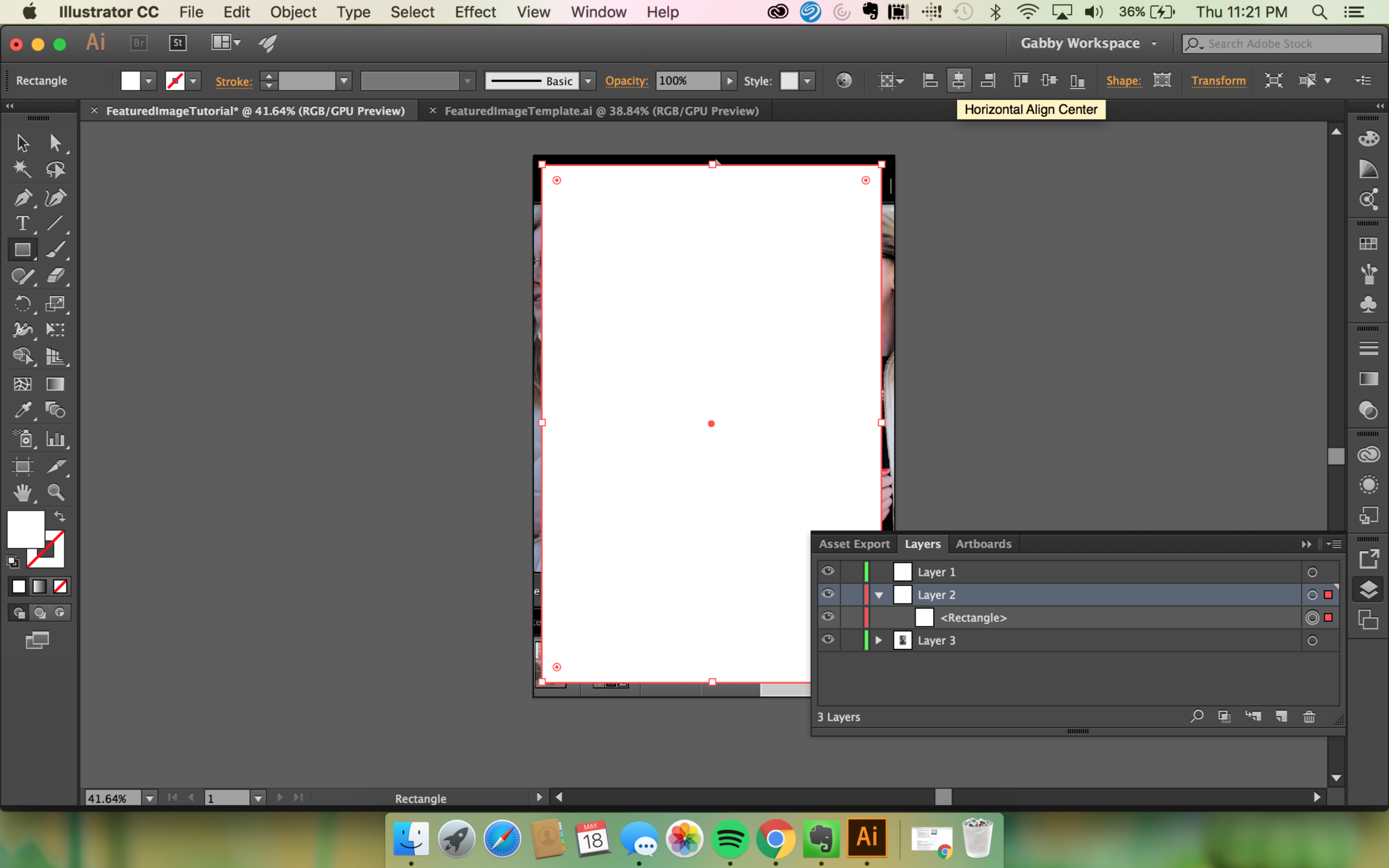
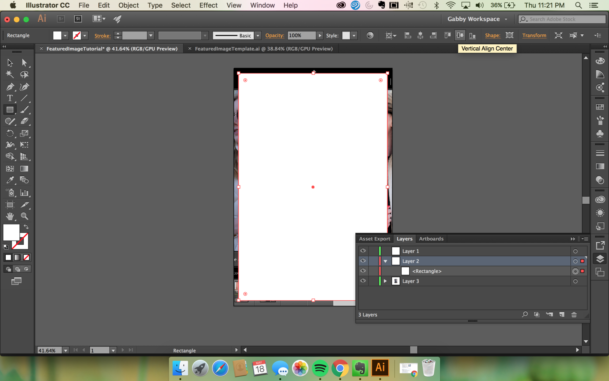
Don’t forget to align the rectangle so you won’t have any weird lines or miss measurements!
Text
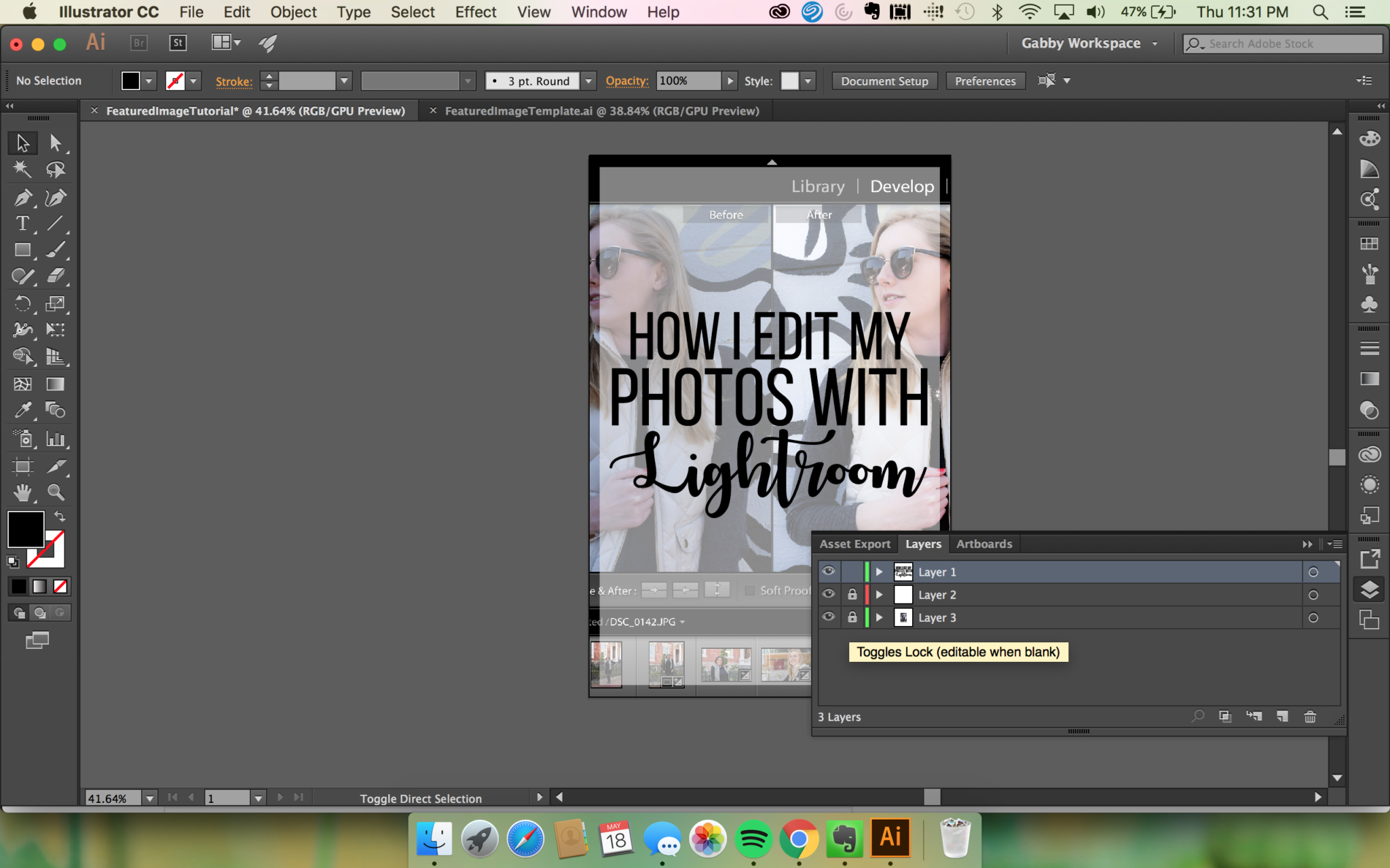
Text will go in level 1. The best way to start is by locking up the other two layers so that they won’t move around when you’re trying to work with text. I personally love mixing script and print with two different fonts, so I make each line of text in a different text box. This allows me to fit each piece into the right spot kind of like a digital puzzle.
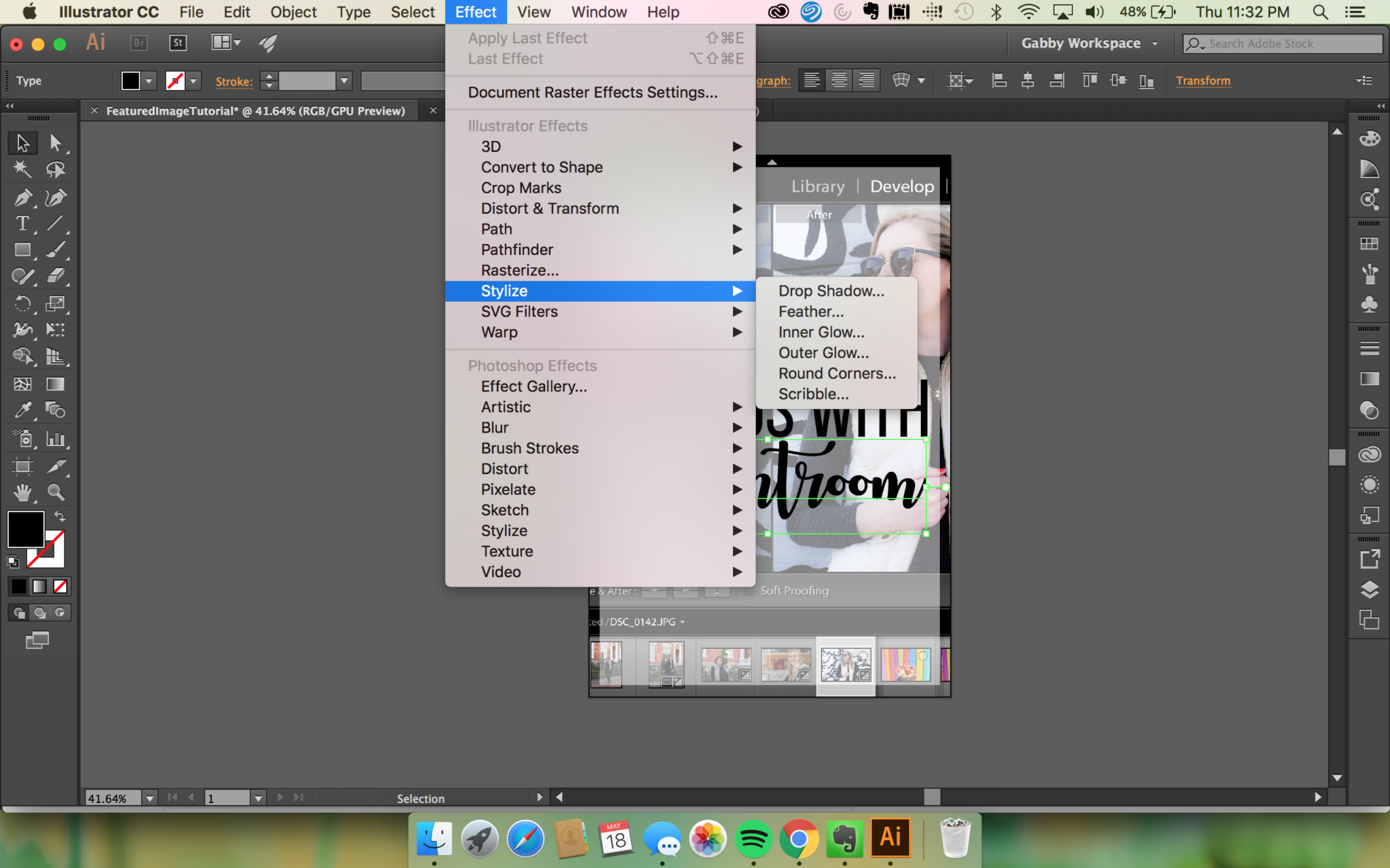
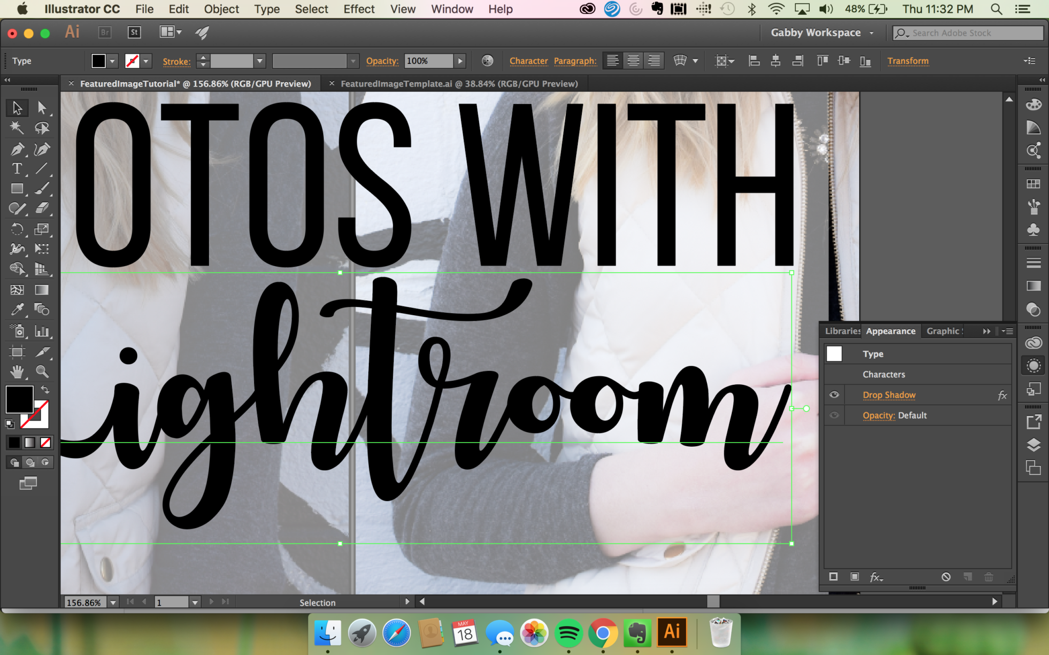
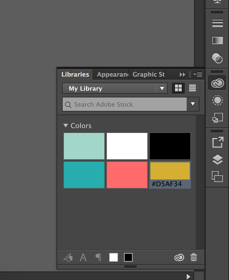
I used Drop Shadow to add that extra dimension and get rid of the flatness that my images used to have on a select 1-2 words in the image. You can also make changes to the Stylistic elements by accessing the Appearance tab on the side menu. This is also where I can find my color libraries! I use the same palette of 5-6 colors and highlight colors. I save these in the Color Library so that I can access them in all of my Adobe software. It comes in handy if I’m trying to edit a photo in photoshop and need to add text that matches our branding!
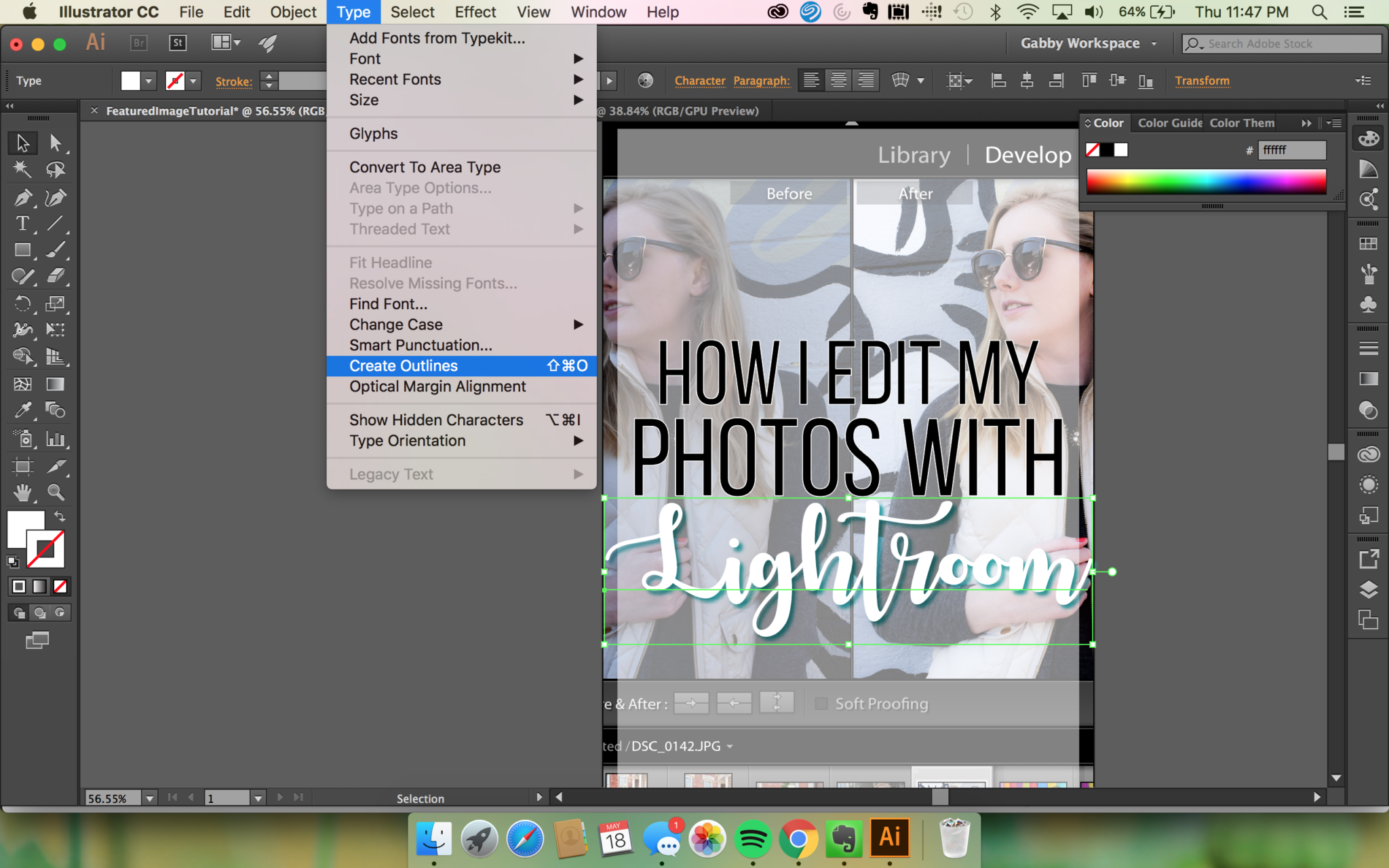
For some fonts, exporting will give you nightmares with weird color changes or random transparent cut outs, you can remedy this by having a create outline option which will also allow you to move individual letters around if you want to do that instead!
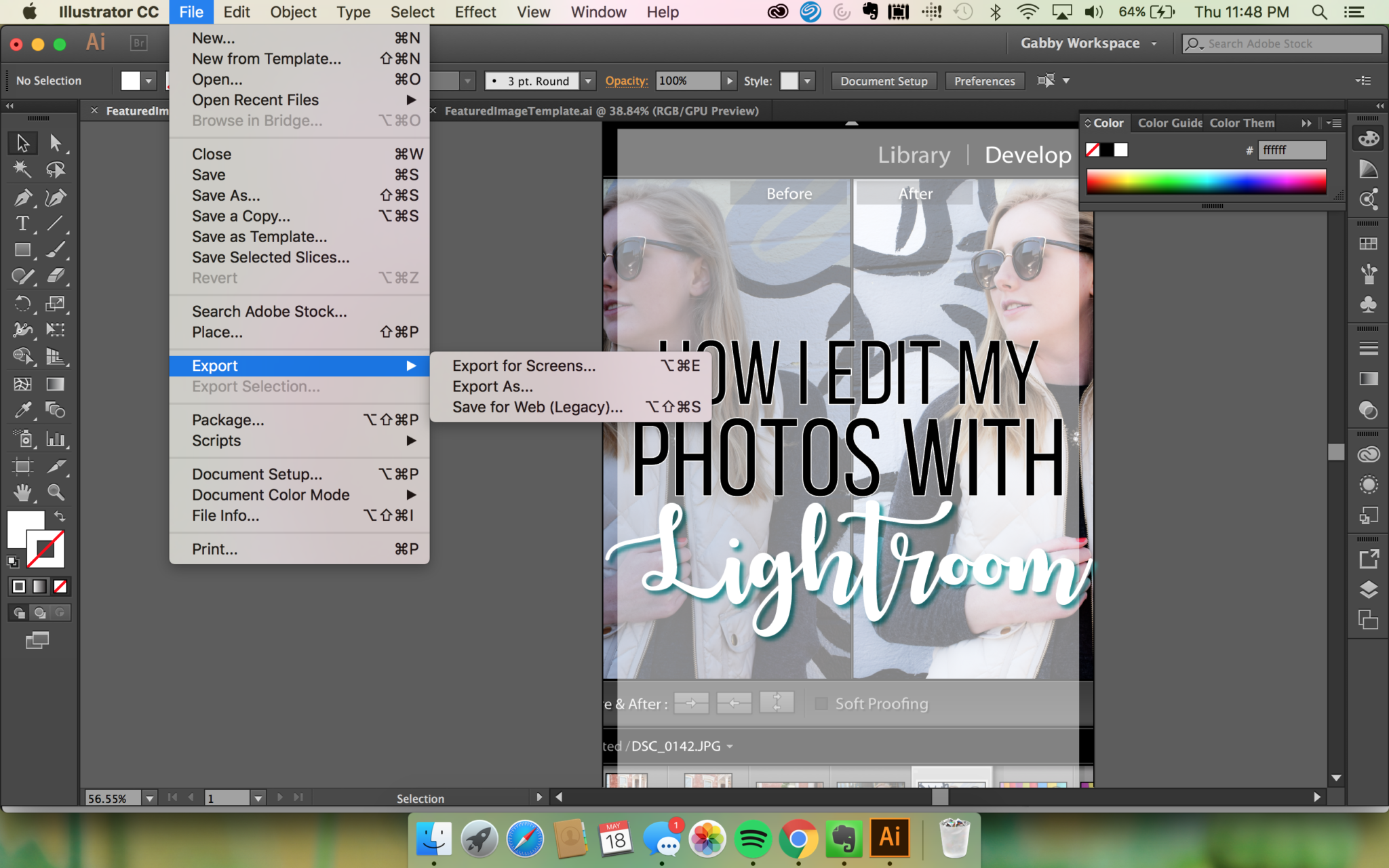
Export Your Masterpiece
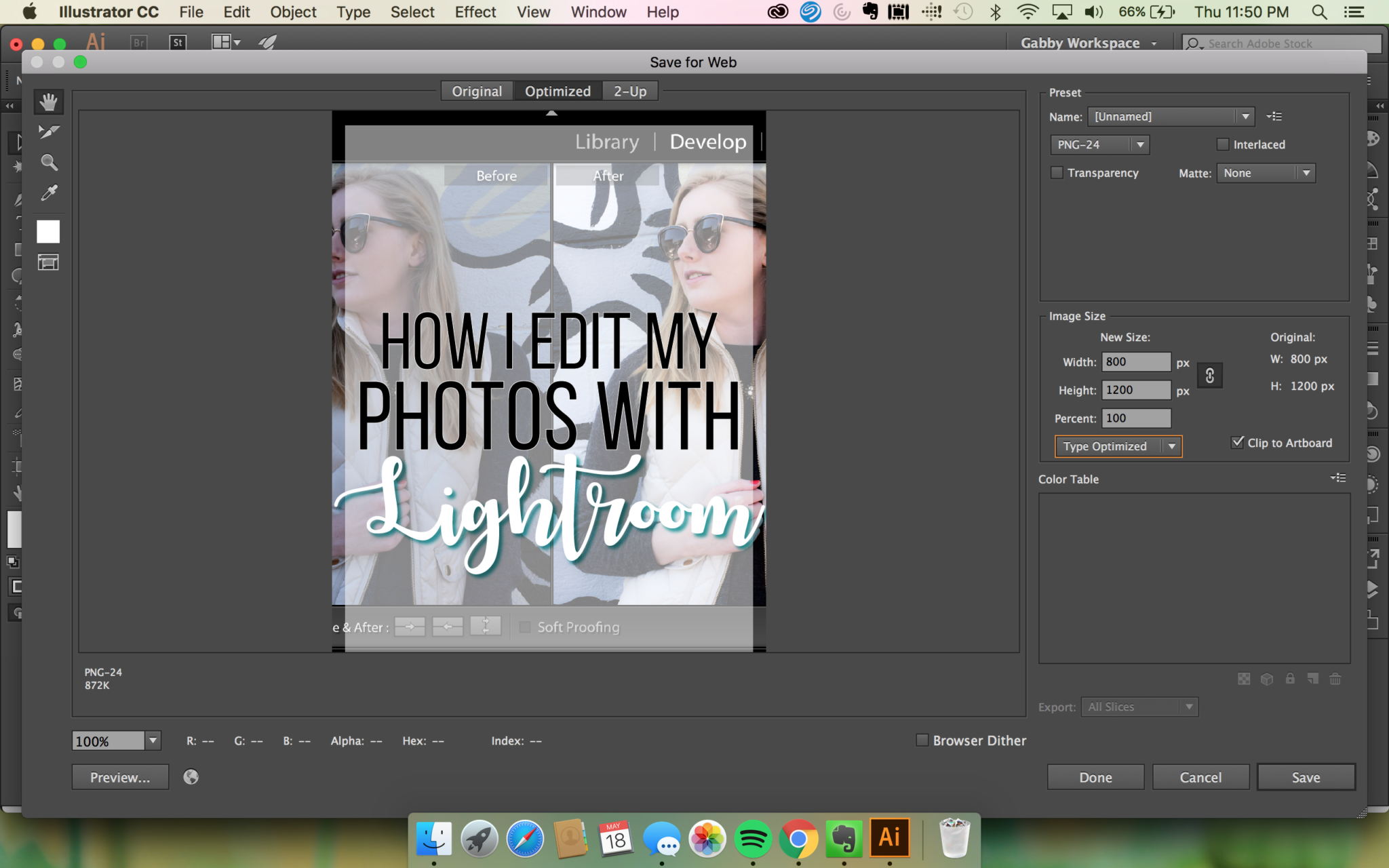
Now, this is the easiest part! You’ll want to save any graphics or images as either a JPEG or PNG. For all the photos within our blog post, I tend to put in PNG form because WordPress automatically reduces the quality of images to improve site speed. We want to have as much detail in images as possible, so we keep them in PNG. For social media, JPEG file formats work best, but also make sure you are still exporting and downloading medium to high quality from all Adobe software!

I hope that was helpful and has given you the confidence to switch over to Adobe or maybe even gave you some ideas for shortening down the time and annoyingness of using the software. Let me know in the comments if you have any shortcuts for me; trust me I would love to cut down as much time as possible doing the nitty gritty.
xoxo,
