One of the most stressful things about preparing a blog post to go live is not even the writing. That is so simple, I can write 1,000 words in about 30 minutes easily. I don’t know if that’s a skill or if I just get super passionate about whatever it is that I’m writing. Most of the total time that it takes for me to finish up a blog post from start to published is spent on graphics!
These are not only what’s going to make your blog post more interesting, but also super important for branding and taking the blog to the next level. You can see how our blog images have progressed from the early early days to right now. One of the biggest things that I love about the graphic design and editing world is that you don’t really need the most expensive software. Aside from video editing, there are several free or cheap options that you can use when you are first starting out.
I can’t rave enough about Canva, and how much I loved using that before switching over to the Adobe Creative Cloud. Also, pic monkey saves lives and you can do a lot of the same things that I do in the Adobe Software now as well! One of the biggest reasons that I switched over to Adobe was because UNC offers it to students for free. One of the many reasons I love my school, seriously. It can be so daunting trying to dive into the world of Photoshop, Lightroom, Premiere, and Illustrator, but I love playing with the new options I find and reading guides online!
Basics and Pricing
I use 3 of the software options the most! I find that these three are perfect for the standard blogger and vlogger. They are: Lightroom, Illustrator, and Premiere. I know that you can get Lightroom and Photoshop CC for 10 bucks a month, which is going to be perfect for the everyday blogger! If you want all in for the creative cloud and you are a student or teacher, you can get the entire Creative Cloud for around 20 bucks a month. I’m not going to lie, this is pretty pricey, but totally worth it!
You can do everything that I’m going to show you in Illustrator in Photoshop, so if you’re only a blogger and don’t want the software to edit videos, the Photography plan should be plenty for ya! Most of the buttons transfer from software to software, so once you learn the basic button vocabulary, as I call it, you should be good to go! If you want to know all about how I edit my photos in Lightroom, then keep reading. {Pt 2 is all about How I Make My Featured Images and will be coming next Friday!}
Lightroom
Lightroom is a blessing and is super easy to use once you know the style of photo you are naturally drawn to, your aesthetic so to speak. I personally love a bright, warm toned photo, and a lot of my photo on here are going to show that! You can also go for a cooler look or darken it up a bit with a sultry signature.
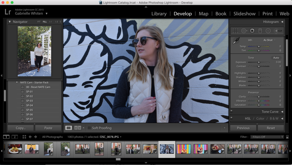
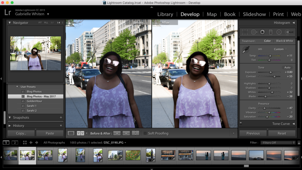
You’re going to spend a ton of time looking at this screen! It’s time to focus your attention on three different sections: Tone, Presence, and Noise Reduction. This where a lot of my editing goes on and literally just involves sliding your cursor from left to right until you hit exactly what you’re looking for. This is going to take time to perfect because you won’t be able to stop until it’s perfect in your eyes, and that’s great!
Here’s the original photo that we’re playing with today:
Tone
Tone is where you’re going to meet up with powerhouses, exposure and contrast. These are the options that are really going to allow you to brighten up your photos and add a little bit of the great thing called dimension. Now, let me show you step by step how I play around with these things to give that bright, dewy picture everyone loves!
Exposure and Contrast
The first thing that I like to do is play with exposure. I usually end up leaving it anywhere around +.75 to +1.35 depending on the picture. I find it easier to really brighten up the photo while you’re in action to keep a lot of the crisp details. For this picture of Han, that was a tad bit dark, I opt for around +.80-.9.
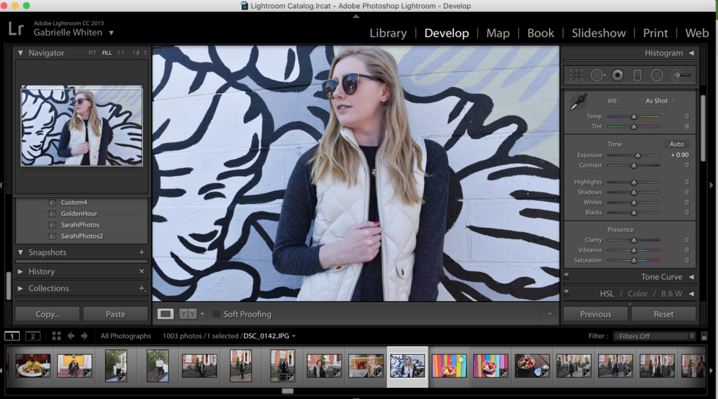
The next thing is bumping up the contrast to give the photo a little more ‘personality’ by giving it deep and vibrant colors. Depending on the photo, you’ll be good with settings around +30-50. We also want to be sure to keep the photo from looking super edited, so I caution anything higher than 60 on the contrast.

Highlights and Shadow
Here is where I would say the trickiest part of the whole shebang comes into play. Highlight is going to give your photos that last title oomph of brightness and shadows is going to play up the ‘drama’. Here we want to strategically highlight and contour—#buzzwords— this photo and we’re going to do just that with these two settings.
Note: There are so many different ways to do this part of the editing. Blacks and Whites will really make the color in your photos pop, while highlight and shadows plays with the light in the photo. Here we have the photo if I only play with Highlight and shadows:
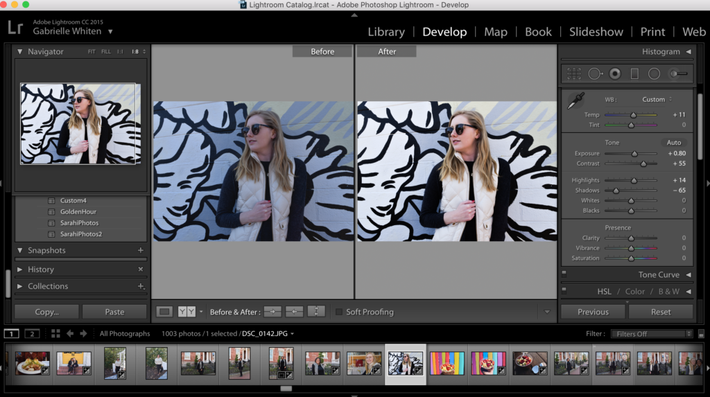 H: +14
S: -65
Here is where I brighten with whites, but also add some depth by darkening the blacks:
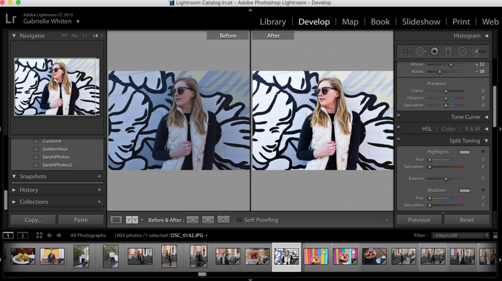 W: +32
B: -38
It’s up to you on what look you go with; but more than not, my photos use all 4 settings and this is going to give a really natural, sunny day-ish looking photo. Also, to add brightness, but also put a little more color on the photo, decrease your highlight down, but blast your whites!
Presence
This is where you get rid of any harshness that comes out in your photo when you change the tone of the photo. We can reduce any super bright and annoying color or just make the picture more muted if that’s your jam.
Saturation and Contrast
Personally, I just want to get rid of the orange-y look by decreasing saturation. As far as vibrance goes, I think whenever I change that function, it makes the picture dull or super vibrant which is going to be a style of some bloggers and is fabulous, but gives me a headache when I’m editing loads of photos. So, not a fan of messing with this setting at all.
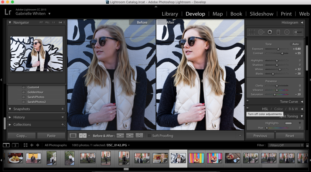
The last thing I tweak is clarity and for portraits that I want to give an airy look; I’ll turn down the clarity and I love that it keeps the crisp lines of a lot of the smaller details; so you won’t have to sacrifice!
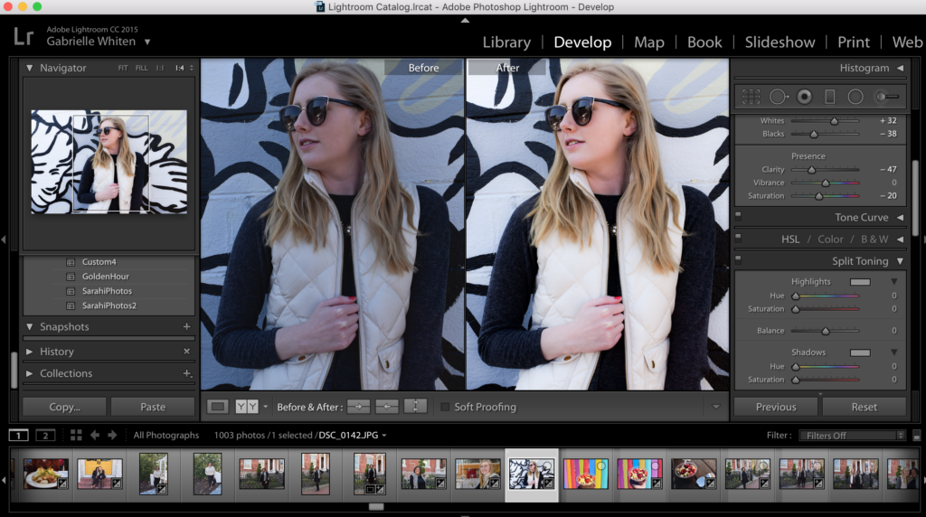 S:-20
S:-20
C:-47
Luminance
I used to be a huge fan of increasing luminance, but sometimes it can be a little distracting and gives a clear indication that you have been photoshopped or edited; so I opt for reducing the clarity instead. Here’s how it looks with luminance at around +60.
However you edit your photos; you want to build consistency to go with your site. Presets are going to be your best friend for this. To create a preset with all your new fabulous settings, you’ll want to: Develop > New Preset > Fill Out Form > Create.
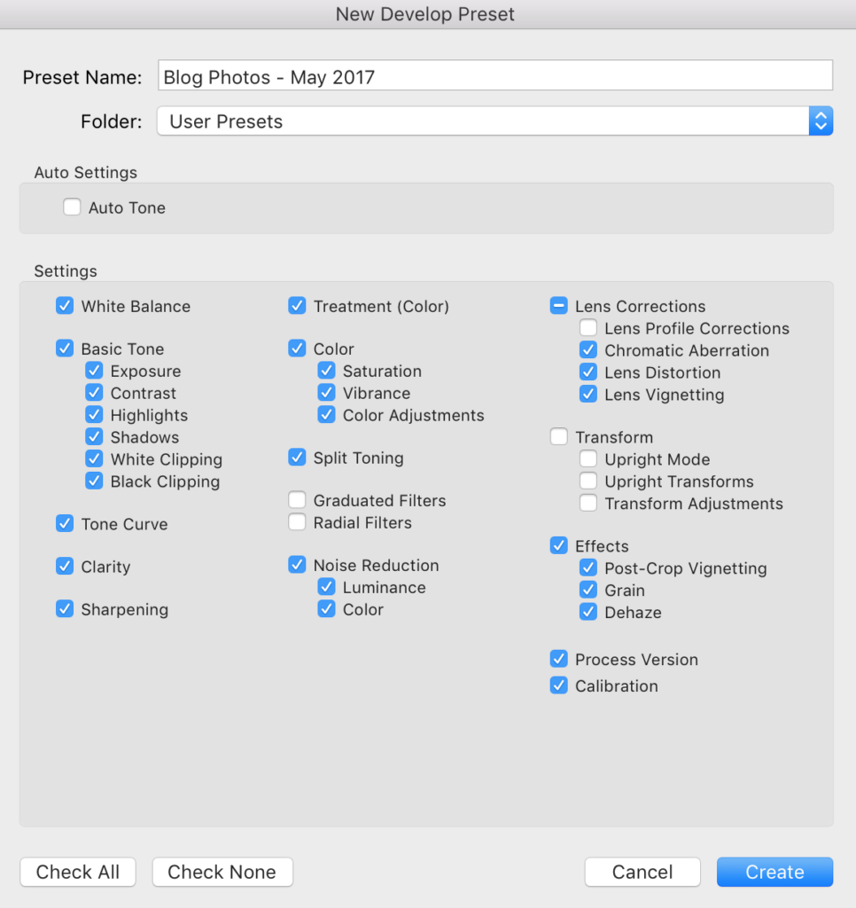
I keep all the settings, because you can tweak anything you need to later depending on the photo. I’ll usually pick three photos that I want to use as a basic template: one that’s brighter, a non-portrait, and something shot in darker light. That way I can have options for any type of situation!
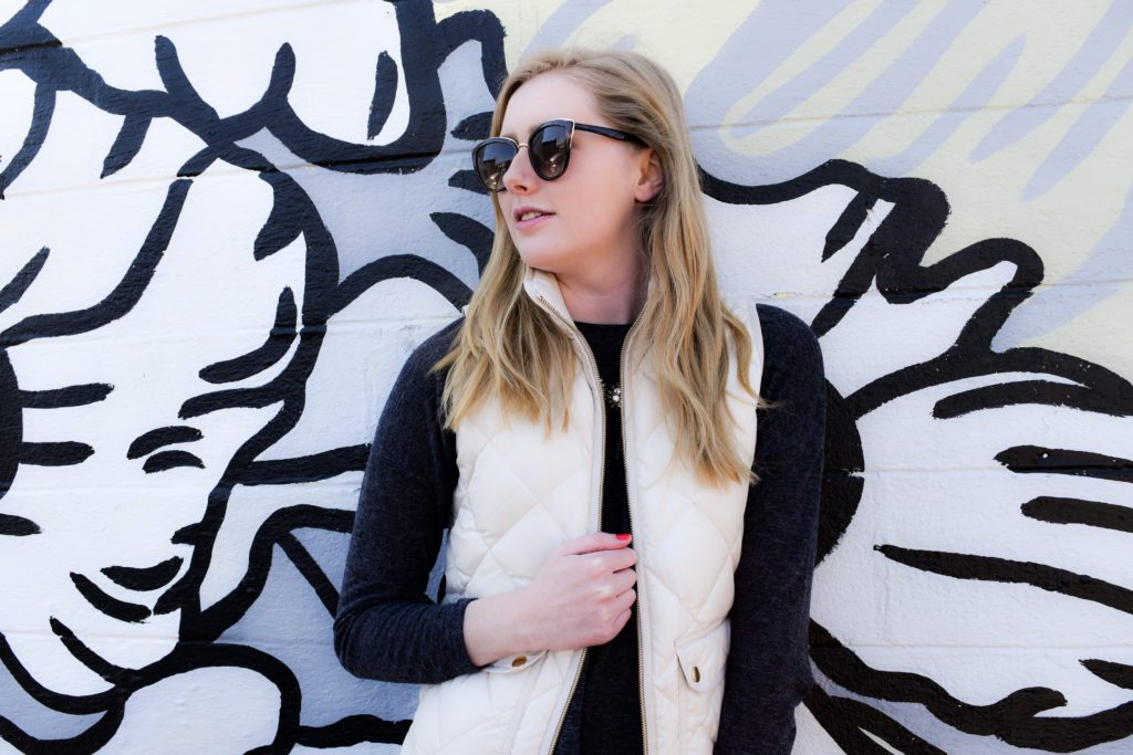
More Edits!
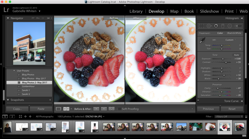
Here are some more pretty fun edits with some small tweaks to my preset!
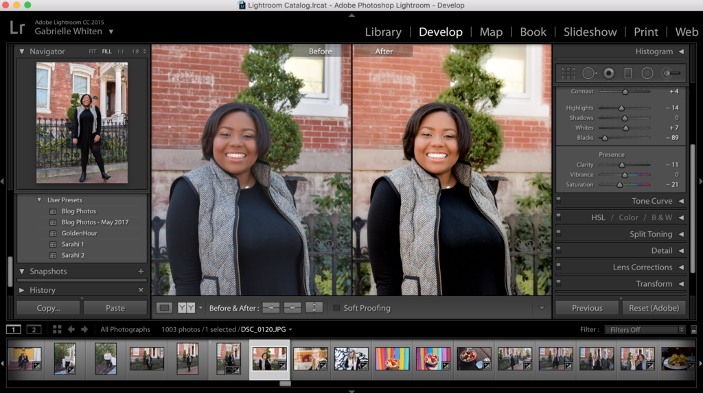
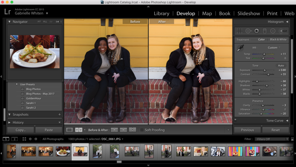
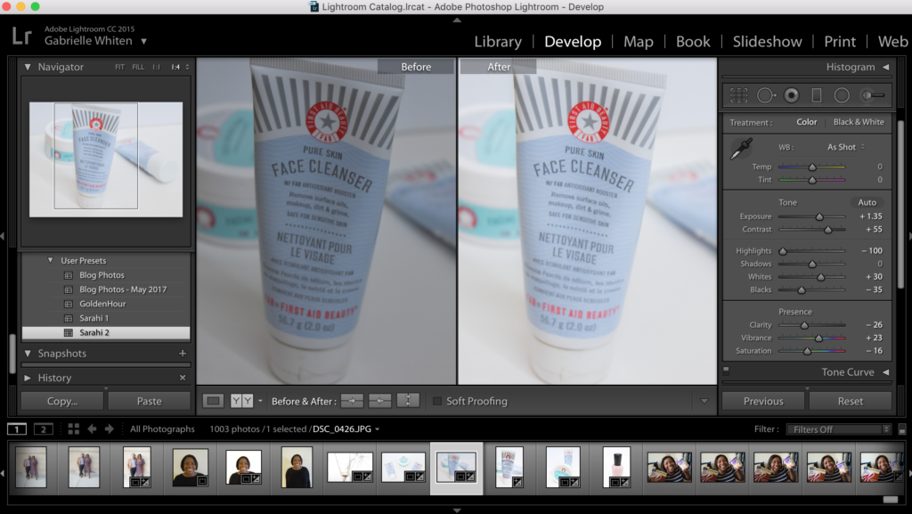
Hopefully, that was helpful, insightful, or maybe just intimidating?! Don’t be intimidated because when I first started using Lightroom, I had no idea what I was doing. The pros of the photography world are probably like: you still don’t know what you’re doing. That’s totally fine. All that mattes is that I love the way my photos turn out! They are bright, happy, and high quality which is amazing! Good luck with your photo adventures!
xoxo,

