If you’re thinking about monetizing your brand, one of the first things you need to do is work on branding. Why? Well, because your blog is something that ultimately represents you; and it makes sense for something that you created to be an extension of yourself. Brands want to work with organized and professional {read: put together & polished} bloggers that have a creative vision and give 110% into whatever project they’re working on!
Hannah and I have had a blast putting on giveaways and working on sponsored posts with several companies now and one thing we are super proud of is our media kit! Keep reading to see what we include, a sneak peak of our design, and get some design inspiration from yours truly! {P.S. I had so much fun designing them.}
1. What exactly is a media kit and why do I need one?
So, you’ve gotten the email; you know… the email asking you to promote, be sponsored by, work with a brand… but first they want to see your media kit. Ha, what’s a media kit? Why would they contact me and then ask for a media kit? Whatever that is. *This was Hannah and I’s reaction and I’m literally not kidding*. A media kit is a 1-3 page document that includes a lot of useful information for marketing reps from companies that are seeking out bloggers to help promote their client/company. It can include site stats, demographics, photography, pricing, and any other information you would like brands to know about you and your blog!
2. Brands only want some key information from you.
You’ll most definitely want to include:
- A Quick Bird’s Eye View of Your Blog
- Page Views {ideally from Google Analytics}
- Unique Visitors
- Social Media Follower Counts
- Audience Demographics
- Brands You’ve Worked With
- Sample Photography
- Contact Information {email, mailing address, phone number}
- Pricing
This is all the info that brands really want to see because it helps them look for bloggers that can hit their target audience with the largest “impact radius” for the most affordable price they can get! It’s easier to have all this information in one place and gives you the opportunity to really shape how your blog is received at a professional level!
Absolutely, do not do anything for free. Companies that value the work of bloggers will make the conscious effort to include them in their budgets. Even if you have a smaller blog, they can work in at least $25 {and that’s extremely low}. #girlboss
3. Brands won’t be contacting me anytime soon, I don’t need to worry about this yet.
Nope! Stop, please, stop! I won’t even begin to tell you the story of me rushing to design a kit in Canva in less than 24 hours so that we could respond to a company that wanted to work with us. If someone would have told me to have one designed and ready to go, that would have given me time to tweak and edit rather than brainstorm and create!
At the same time, It’s okay to wait off on working with brands if you don’t feel like you have a strong enough audience or if you really don’t want your blog to go in that direction. It’s extremely easy to get caught up in working with brands and companies because you feel like you’re finally getting acknowledged for all your hard work, but sometimes it’s not for you. That’s 100% okay! Just be polite and try to respond as soon as possible because you don’t want to burn bridges that you might want to cross in the future!
4. Nobody said it couldn’t be pretty and infused with personality!
This was my favorite part of giving the blog and all of our designs on social media a face lift! I think if I didn’t like science and medicine so much, that I would go into marketing because I am fascinated by branding and design and social media and everything! Here’s a before and after of our media kit:
These are the front pages of our media kits before and after the blog revamp and you can see there is a stark difference between the two! If you’re connected with us on social media you can tell that we have a color scheme and common design elements like circles, dots, and bright colored photography!
5. It’s a good way for you to see your progress and assess your blog.
This blog definitely started as a hobby for both Hannah and I! I don’t think you go into it thinking that you’ll make money or be given free things and to be honest; it’s still surreal when I get those kinds of emails. Let me tell you, I would be just content talking all about my organization tips for college, what Starbucks drink I’m obsessed with, and my seasonal favorite without a sponsor in site.
However, I do think a media kit is something that is good for your site as you try to hone in on what you want to focus on as far as your audience and content. When you need to sum up your blog in three sentences, it’s a lot easier if you have a clear cut focus of what to say about it. Keeping track of your statistics and demographics and their patterns are also super important to asses your blog’s success. I know that our college posts are most appreciated on our site and our blogger basics posts have become super popular!
Design Inspiration
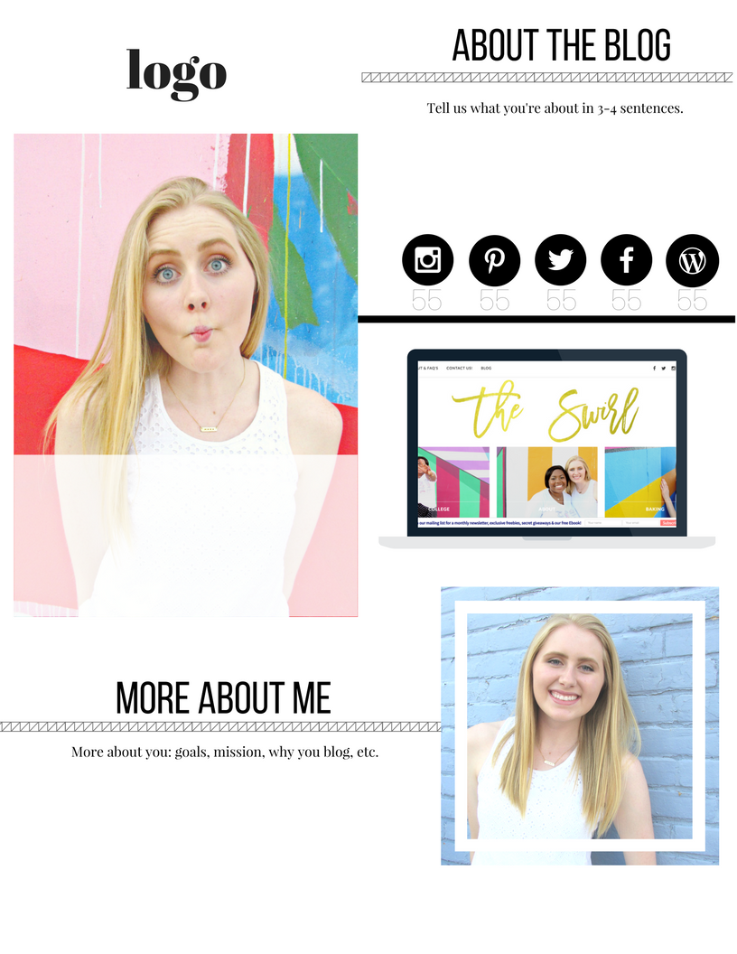
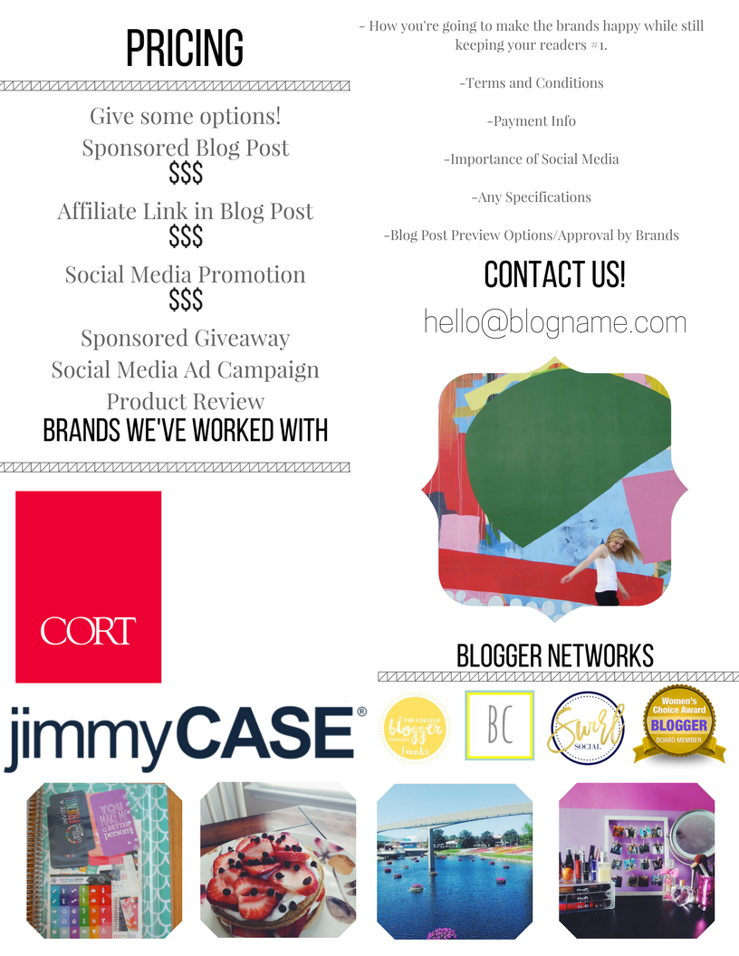
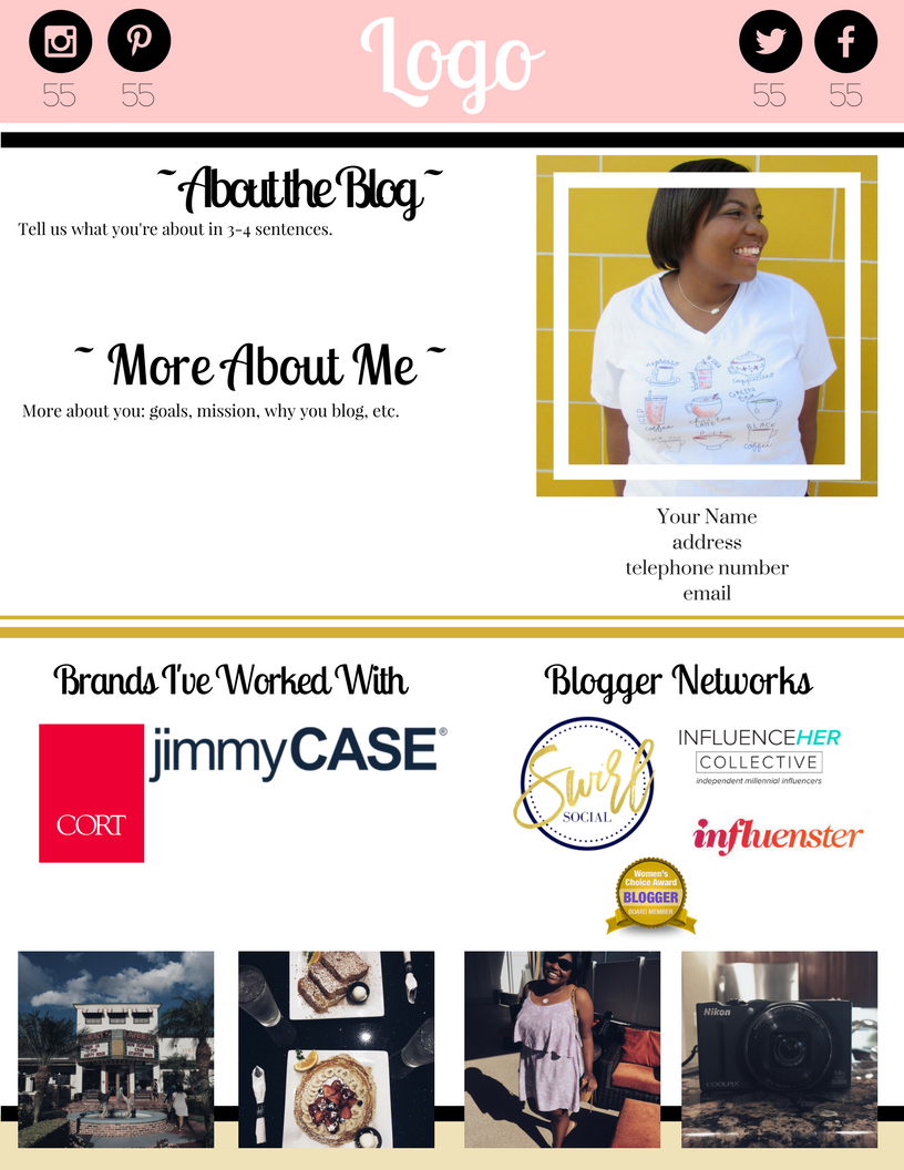
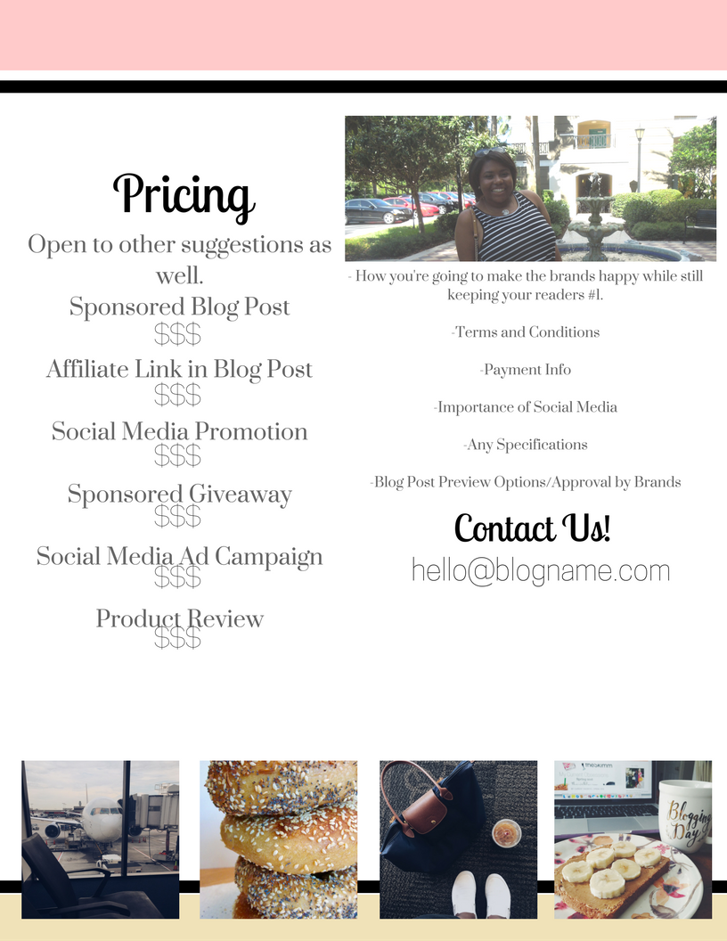
Here are some designs that I played around with in Canva! Obviously, you would use your own pictures and font choices and color schemes! I made the first design with black and white detailing to showcase blogs with pictures that have bright colors and want to focus on that aspect of the blog! The second one is for blogs that have muted picture color schemes, if you have a sultry Instagram theme, you can steal pictures from there and add them into a media kit with more bright colors! Let me know if you have any questions about using Canva or how I designed something by DM or email: gabby@theswirlblog.com! You can also check out this fantastic how-to guide for making a media kit with Canva from Rachel over at Seashells + Sparkles!
With love,

Be sure to follow us on all of our social media {think Instagram, Pinterest, Snapchat, Facebook, Twitter} @theswirlblog! Have you seen my first vlog?
